Within the Customer Acquisition team at audibene, it was the responsibility of the CRO team, the Front-end team, and me to deliver a seamless experience for prospective leads, streamlining the registration process while ensuring users were efficiently informed before being contacted by our consultants.
Operating in an Agile environment, we conducted A/B tests across each stage of the user journey, including landing pages, questionnaires, and success pages. This iterative approach enabled us to identify specific pain points, address them methodically, and ideate targeted solutions to improve the overall customer experience.
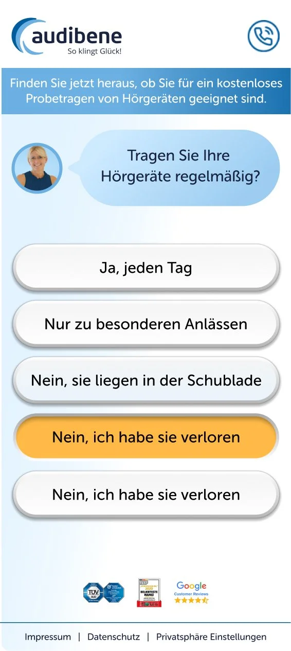
A critical component of this journey was the full-page questionnaire, which users completed after expressing interest in a free fitting session via our conversion CTAs.
This project started with one question: why are so many people giving up halfway through our sign-up form? The questionnaire sat right between a user clicking 'I'm interested' and getting a free hearing test booked. I owned the redesign end to end, figuring out what was broken, designing a fix, and proving it worked."
Objectives for the redesign:
Align with corporate identity: The new design had to adhere to the updated audibene brand guidelines established earlier.
Enhance usability and engagement: The design needed to be simple, engaging, and well-structured, enabling users to complete the questionnaire without omitting information or abandoning the process. Success would be measured by minimizing bounce rates and maximizing conversion rates at key steps (CR1 & CR2).
From left to right: old version of one of our old pages overlaid with the redesign goals. Next to it, the redesigned version after the changes became the next best performer.

Improvements and Result
Beyond adapting the questionnaire to the new corporate design, I introduced several targeted changes aimed at improving user engagement and achieving our objectives. These included more effective use of spacing, a brighter and more approachable color palette, and the incorporation of lively visual elements such as real human faces and subtle 3D effects to create familiarity and enhance engagement.
For this initiative, I led the design of the MVP and a low-fidelity prototype, grounded in my hypotheses about what would best support a successful user journey. Throughout the process, I continuously incorporated feedback from the CRO team to refine the design.
Following testing of the second high-fidelity prototype, metrics demonstrated clear improvements in both bounce rate and questionnaire completion. Based on these positive results, we proceeded with development and launched the new version. The live implementation exceeded expectations, showing a 26% decrease in bounce rate, a 31% increase in CR1, and a 22% increase in CR2, surpassing our original targets and validating our design decisions.
FROM LEFT TO RIGHT: OLD INTERFACE ELEMENTS VS NEW ONES