Redesigning audibene
2022. UI/UX Design & Research. audibene GmbH
Overview
A homepage redesign for Europe's largest hearing care platform, built to earn trust, explain a complex model, and convert a sceptical audience across multiple markets. Their platform connects people experiencing hearing loss with independent hearing care professionals, offering free consultations, 30-day product trials, and expert guidance, all without the stigma and friction that had historically kept people from seeking help for an average of seven years.
B2C | Homepage Redesign
The Challenge
A page that needed to do more than look better.
The redesign wasn't just a visual refresh. The existing homepage had structural problems: it didn't build trust quickly enough for a medically sensitive audience, its conversion path wasn't clear, and it wasn't adequately representing audibene's maturity as a global platform. The goal was to redesign a page that earns belief before it asks for action.
What needed change
Trust signals were either absent from the hero or scattered throughout the page without hierarchy
The unique audibene model, not a shop, not a clinic, but a platform, wasn't explained clearly enough to reduce drop-off
The visual language felt dated relative to the brand's premium positioning and growing international scale
An older primary audience (50+) needed high readability, but existing typography and spacing made scanning difficult
No clear, persistent primary CTA; users didn't know what the single next step was

Redesign Goals
Establish immediate trust through confident visual language and strategically placed social proof
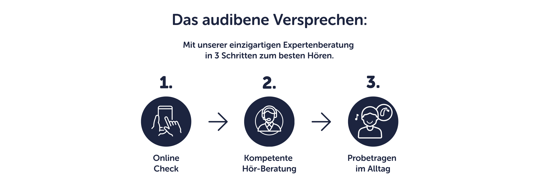
Explain the three-step audibene journey clearly: Online Check, expert consultation, free trial, as a reassuring process
Modernise the visual system while staying within Museo Sans Rounded brand foundations
Design a layout that works for a 50+ audience: generous spacing, high contrast, unhurried pacing
Produce a system flexible enough to deploy across German, Swiss, and Dutch markets
Understanding the audience
The average person waits 7 years before seeking treatment for hearing loss. That's not stubbornness; it's stigma, uncertainty, and a fear of complexity. audibene's homepage has to dismantle those barriers before it can ask for anything.
-
Adults aged 50–70 with early to moderate hearing loss. Researching either for themselves or a parent. Cautious about medical decisions, sensitive to cost, and wary of salespeople disguised as advisors.
They need to feel seen, not sold to.
-
Usually via search, "Hörgeräte Test" or "Hörgeräte kaufen". They may have tried cheap over-the-counter devices that didn't work. They're not sure they need one yet. The homepage is often their first encounter with a credible option.
Every second of confusion increases exit probability.
-
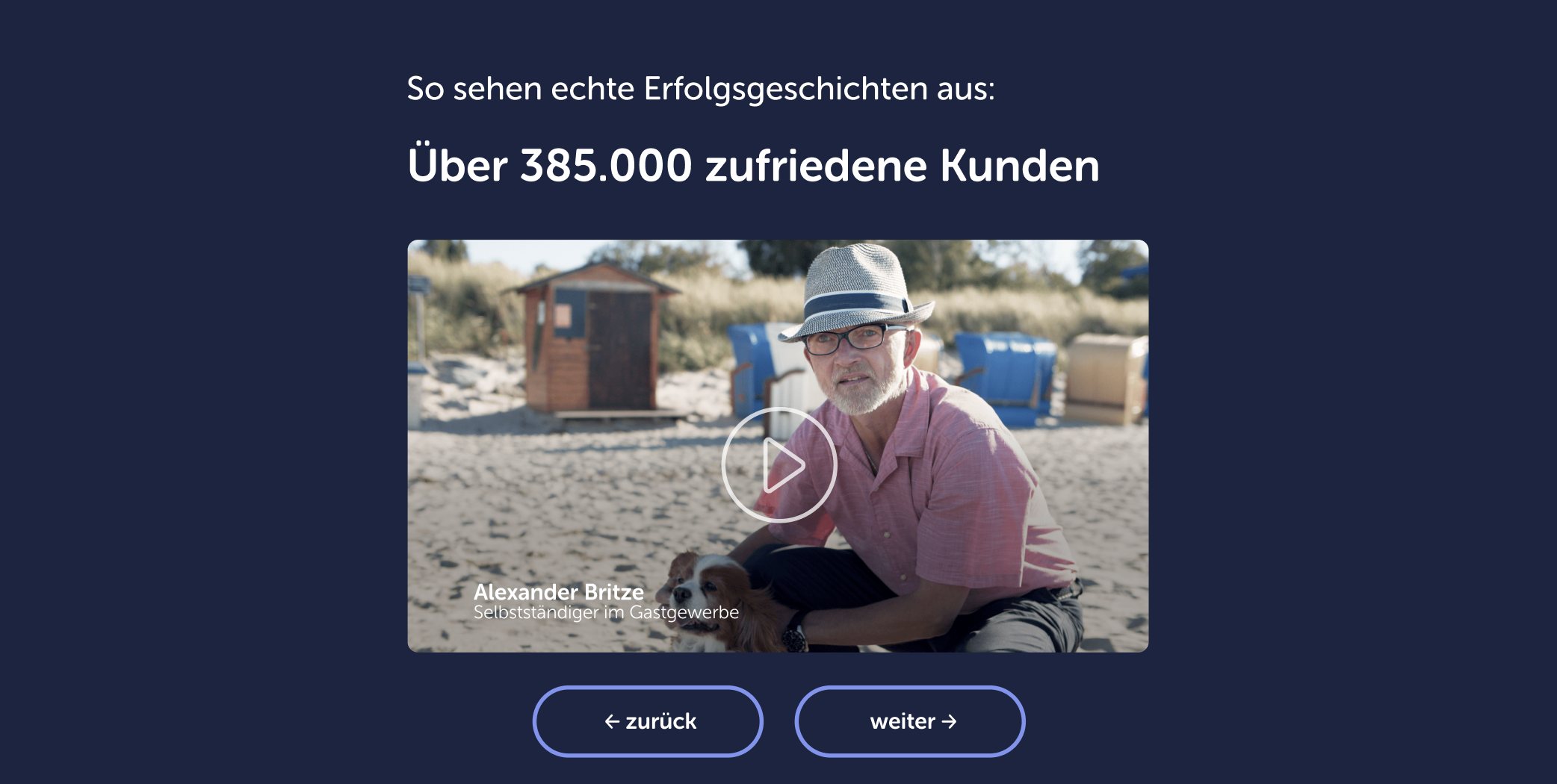
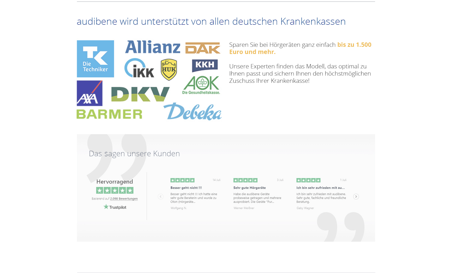
Real customer numbers ("Über 385.000 zufriedene Kunden"). A clear, low-pressure explanation of the next step. Visible insurance partnerships (Krankenkassen). Expert credentials. And a design that respects their intelligence and time.
The next step must feel small and reversible.
Page Architecture
Every section has a role in the conversion journey.
The redesigned homepage tells a story in nine acts, and each section moves the user from first impression to confident action. The structure was mapped directly from the final Figma file, with the German copy as the primary market baseline.
-
![]()
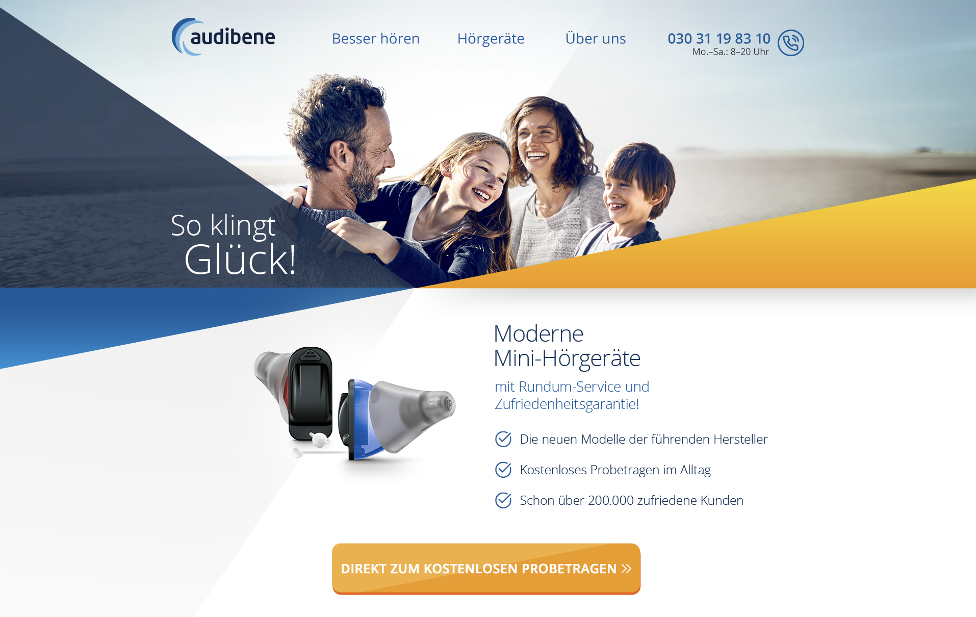
Hero
"Smarte Hörgeräte, von der weltweiten Nr. 1 im Internet"
-
![]()
Emotional Hook
"Das Leben klang nie besser."
-
![]()
The audibene Promise
"Das audibene Versprechen"
-
![]()
Social Proof / Testimonials
"Überzeugen Sie sich selbst!"
-
![]()
Scale Proof
"Über 385.000 zufriedene Kunden"
-
![]()
Insurance Partners
"In vertrauensvoller Zusammenarbeit mit allen Krankenkassen"
-
![]()
Experts Stories
"Von Menschen für Menschen"
-
![]()
Product Range
"Alle neuen Modelle, alle führenden Marken"


Visual Language
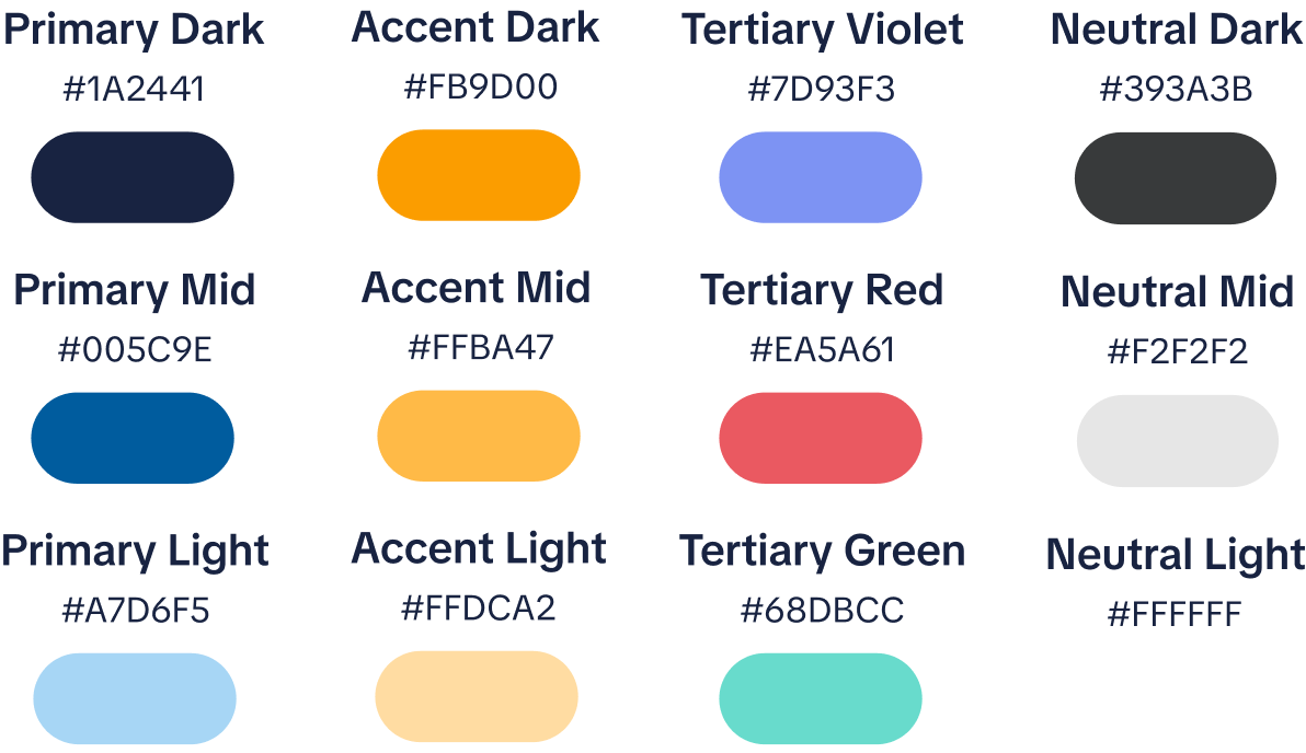
The palette is deliberately constrained: deep navy signals medical authority and reliability, the orange CTA creates a warm, human action point that never feels aggressive, and the light blue sections provide tonal breathing room in the emotional sections.
Museo Sans Rounded was audibene's existing brand font. Its rounded terminals make it inherently approachable, avoiding the cold precision of geometric sans-serifs that can feel clinical in a healthcare context.

Key Design Decisions
-
Trust is a prerequisite, not a reward
In most e-commerce contexts, the hero sells the product. In healthcare, a user who doesn't feel safe won't act, no matter how compelling the offer. The redesign placed trust signals, the "Nr. 1 im Internet" positioning, and the implicit promise of a free, no-pressure process in the hero itself, before any ask. Social proof was then layered strategically throughout: aggregate numbers first, then individual stories, then expert endorsements. Each layer speaks to a different stage of emotional readiness.
-
Making the three-step model unmissable
Flexible, expert advice when you need it. Book hourly support across a range of topics, from planning to problem-solving. This focused consultation will help clarify your goals, map out next steps, and identify growth opportunities.
-
Designing for 50+ without designing down
With a primary audience skewing 50+, accessibility constraints shaped every typographic decision: generous body text sizing, high contrast ratios, and unhurried section spacing. The challenge was proving that accessibility and visual confidence aren't opposites; the final design is bold and contemporary while being genuinely comfortable to read for someone encountering it on a laptop for the first time.
-
The orange CTA as a warm invitation
The orange (#F5A623) CTA button was a deliberate counter to the deep navy palette. Healthcare brands often use cold blues and greens for CTAs, which can feel clinical or institutional. The warm orange creates a moment of human warmth within an authoritative colour context, it signals "this is an easy, friendly first step" rather than "this is a medical transaction."
This is an interactive prototype; scroll down and navigate through the final design.
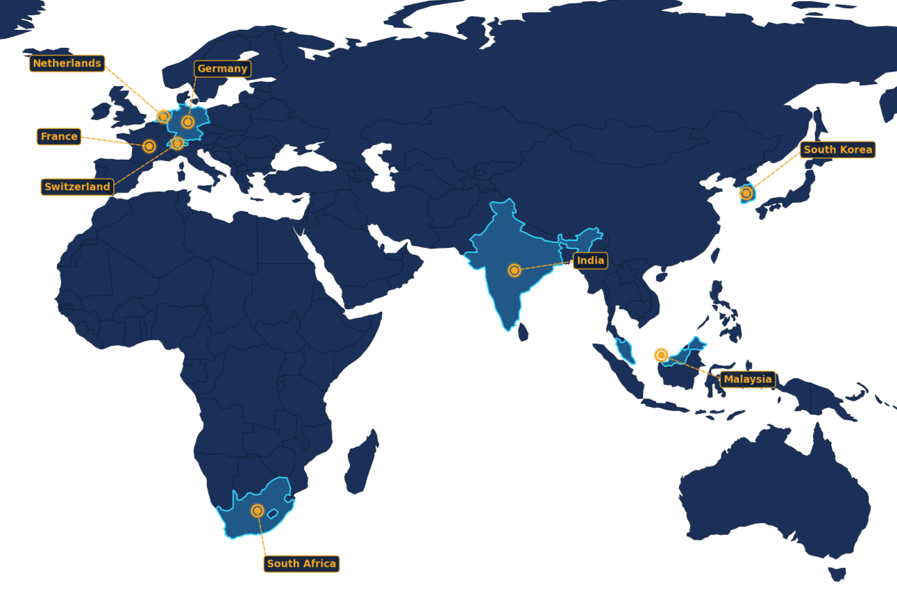
Multi-Market Scope
The homepage was designed first and foremost for Germany, audibene's home market and largest user base. But the real test of any design system is what happens when it travels. After the German baseline was established, seven additional markets adapted the architecture to their own languages, healthcare frameworks, cultural contexts, and user expectations.
This required the design to be genuinely flexible, not just translatable, but structurally adaptable. Section order, trust signal types, insurance partner grids, and CTA language all needed to shift market by market, without ever losing the coherence of the core visual system. The grid, the type scale, the colour logic, the component library, all of it had to hold up whether the copy was German, Dutch, French, Tamil, Korean, Afrikaans, or Malay.
Designing for that kind of flexibility is a discipline in itself. It means resisting one-off decisions that work only in one language or cultural context. Every layout choice had to pass a simple test: does this survive translation? Does this work when the headline is 40% longer? Does this trust signal mean anything to someone in Seoul or Kuala Lumpur who has never heard of audibene?
One design system.
Eight markets. Zero compromises.
Reflection
Healthcare UX is a different discipline
In consumer products, reducing friction is almost always the right move. In healthcare, it's more nuanced; the design has to make the next step feel easy while still letting the decision feel considered. That tension is one of the most interesting problems I've worked on.
Working in-house also meant designing within real constraints: an established brand, regulatory requirements, multi-market needs, and stakeholder feedback. Those constraints aren't obstacles to good design. They are the material of it.
Accessibility improves everything.
Every choice made for a 50+ audience- generous spacing, high contrast, and clear hierarchy made the page better for everyone.
Social proof placement matters more than volume.
385,000 customers is a strong number, but only once the user understands the model. Sequencing is everything.
Multi-market work reveals what's truly structural.
Designing across 8 markets exposed which decisions were universal and which were just German-language assumptions in disguise.
From left to right, new sections vs the old ones
Intro / Call to Action / Value Proposition

Trust Points / Interactive Elements


Internal Links / Footer

