Paw Art
2026 · Product Design & Research · Spiced Academy
Overview
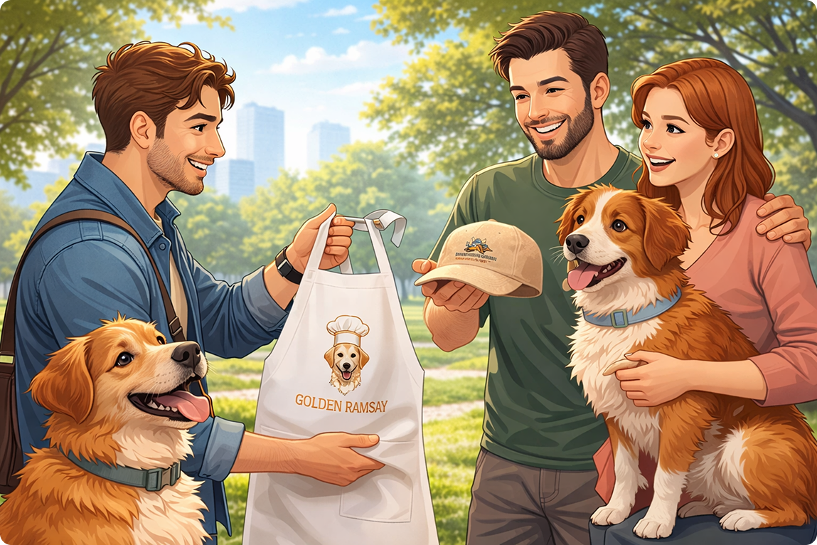
PawArt is an e-commerce experience designed for pet owners who want to create personalized products featuring their pets. The project focuses on making customization feel simple, engaging, and emotionally meaningful rather than overwhelming or transactional.
The goal was to design a platform that enables users to actively participate in the creation process while confidently navigating from product selection to checkout.
E-Commerce | UX-Driven Interface
The Problem
Most customization platforms focus heavily on functionality, but often overlook the emotional side of the experience. The process can quickly become confusing, cluttered, or repetitive, making users feel disconnected from what they are creating.
For pet owners, this is especially important.
A pet is not just an animal. It represents memories, personality, and emotional attachment. Creating a personalized product with a pet should feel meaningful and enjoyable, not stressful.
The Goal
The main objective was to create an intuitive and visually engaging e-commerce experience that:
Simplifies the customization process
Makes users feel emotionally connected to their designs
Encourages interaction and creativity
Maintains clarity throughout the journey
Creates a modern and memorable visual identity
User Story
“As a pet owner, I want a fast and intuitive way to create personalized, meaningful products featuring my pet, so that I can design something unique for myself or as a thoughtful gift. I want to easily navigate an e-commerce platform that offers an interactive and engaging customization experience, allowing me to actively participate in the design process and confidently complete my purchase.”
Design Approach
When approaching this project, I focused on preserving the emotional connection users have with their pets throughout the entire experience.
Instead of treating customization as a technical process, I designed it as a creative and personal journey.
Every design decision was guided by three core principles:
The platform needed to feel intuitive enough for users to navigate effortlessly, while still being playful, expressive, and interactive.

Moodboard
To define the visual tone of the project, I created a moodboard exploring:
Typography styles
Color palettes
Layout references
Interaction inspiration
Overall emotional tone
The goal was to find a visual language that feels modern, expressive, approachable, and fun without overwhelming the user.
The moodboard became the visual foundation for later design decisions.
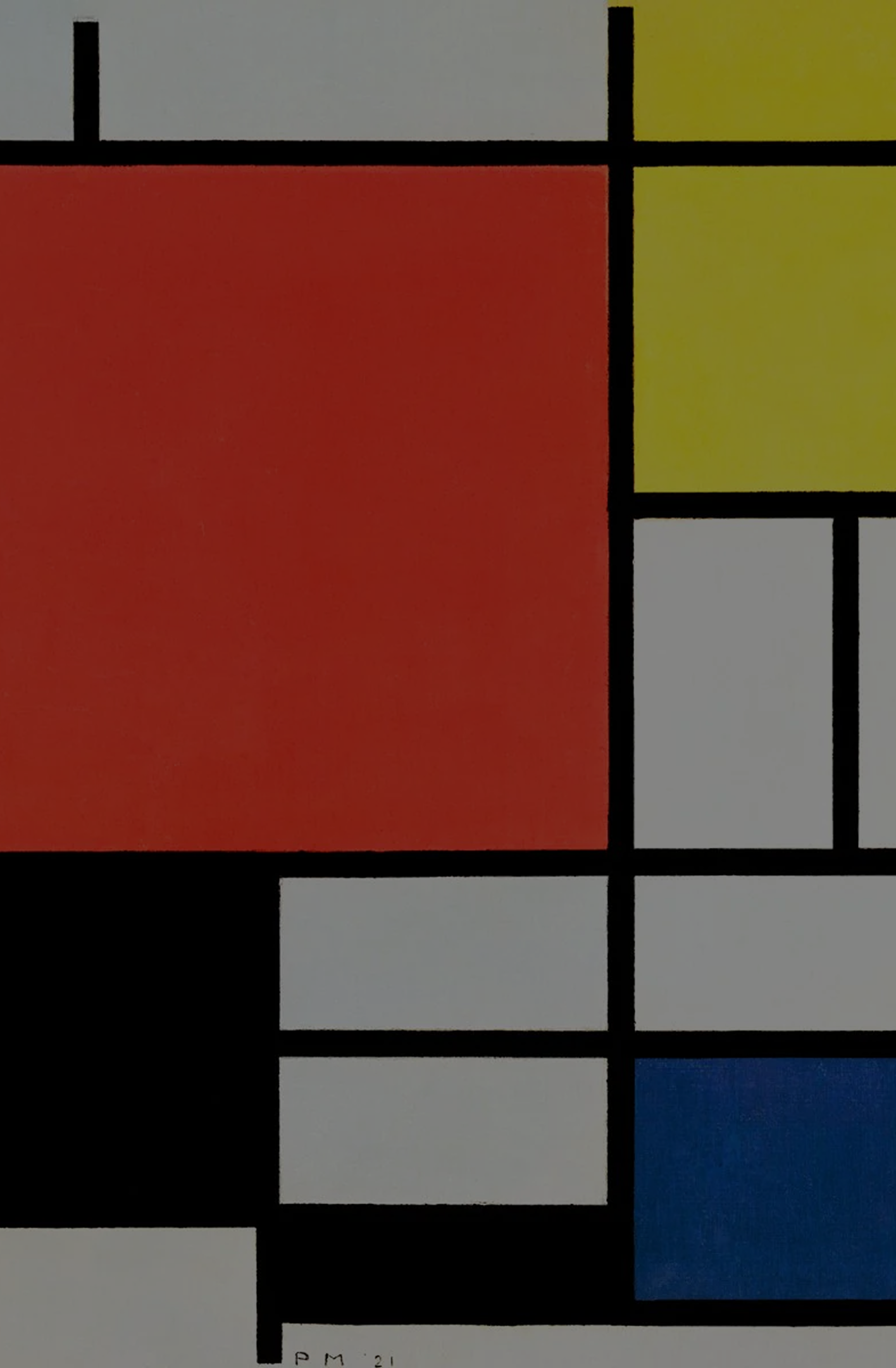
Concept & Inspiration
The visual direction was inspired by Piet Mondrian’s artwork.
His structured grid compositions created the foundation for the layout system, helping maintain organization and clarity across the interface.
At the same time, the bold colors and asymmetrical compositions introduced a playful and energetic tone that aligned with the emotional and creative nature of the platform.
This combination helped establish a balance between usability and visual engagement.
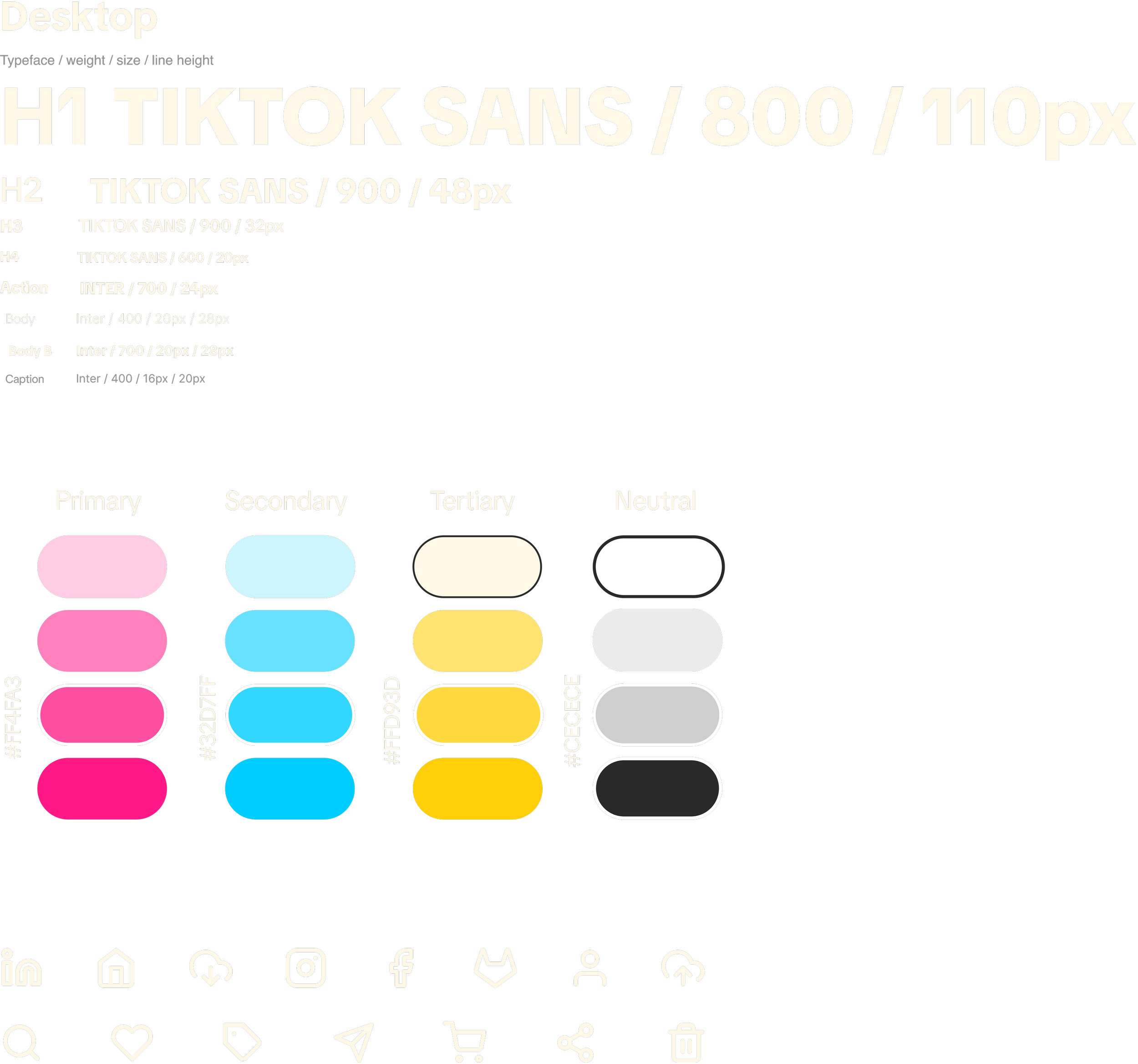
Visual Language
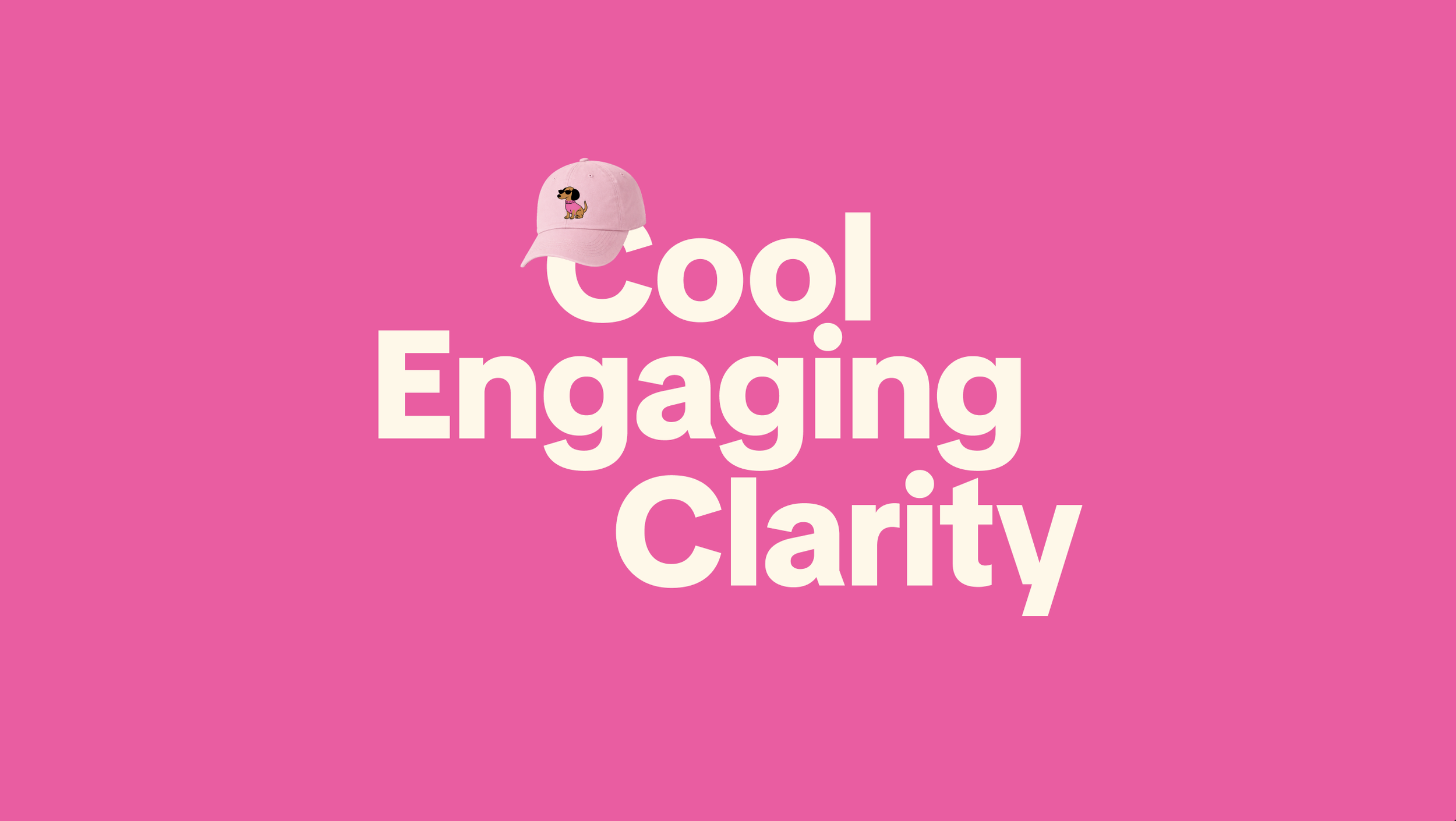
The visual language focused on creating a bold yet clear interface that feels both playful and intuitive. Strong, modern typography was used to establish hierarchy and readability, while a vibrant color palette introduced energy and personality into the experience. Bright pink tones were used to create emphasis and interaction, balanced by cooler blues and soft neutral backgrounds to maintain clarity and structure.
To reinforce the friendly and engaging tone of the platform, the interface also included rounded components, playful illustrations, and simple iconography. Together, these elements created a cohesive visual system that supports both usability and emotional connection.
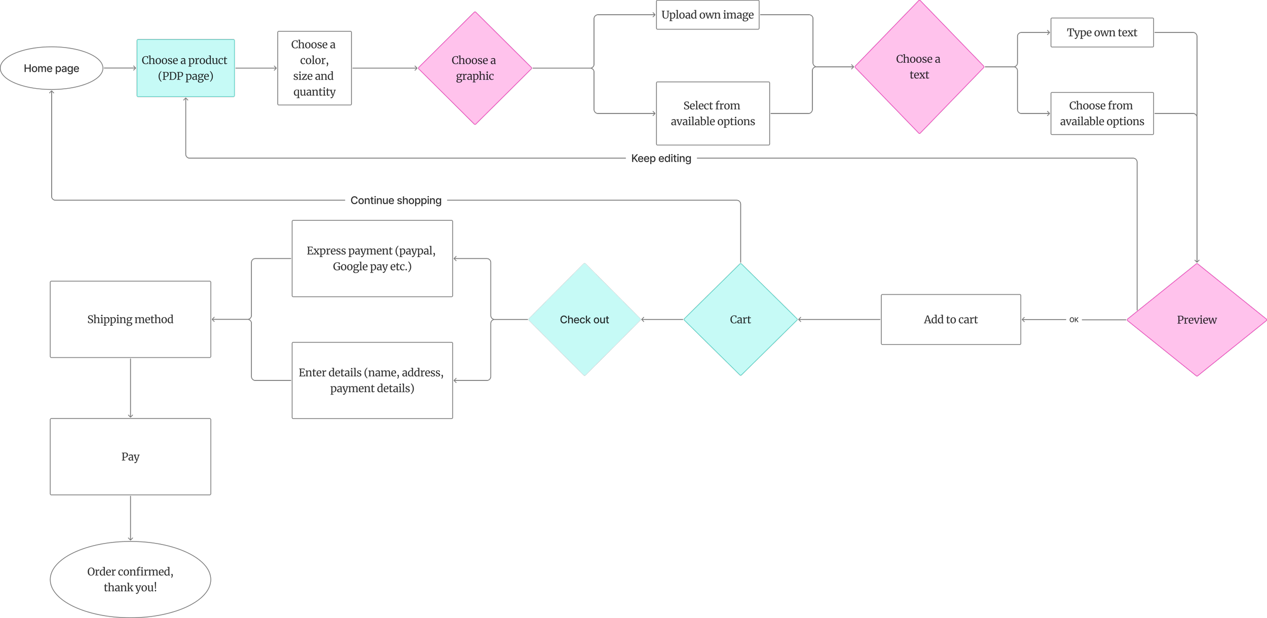
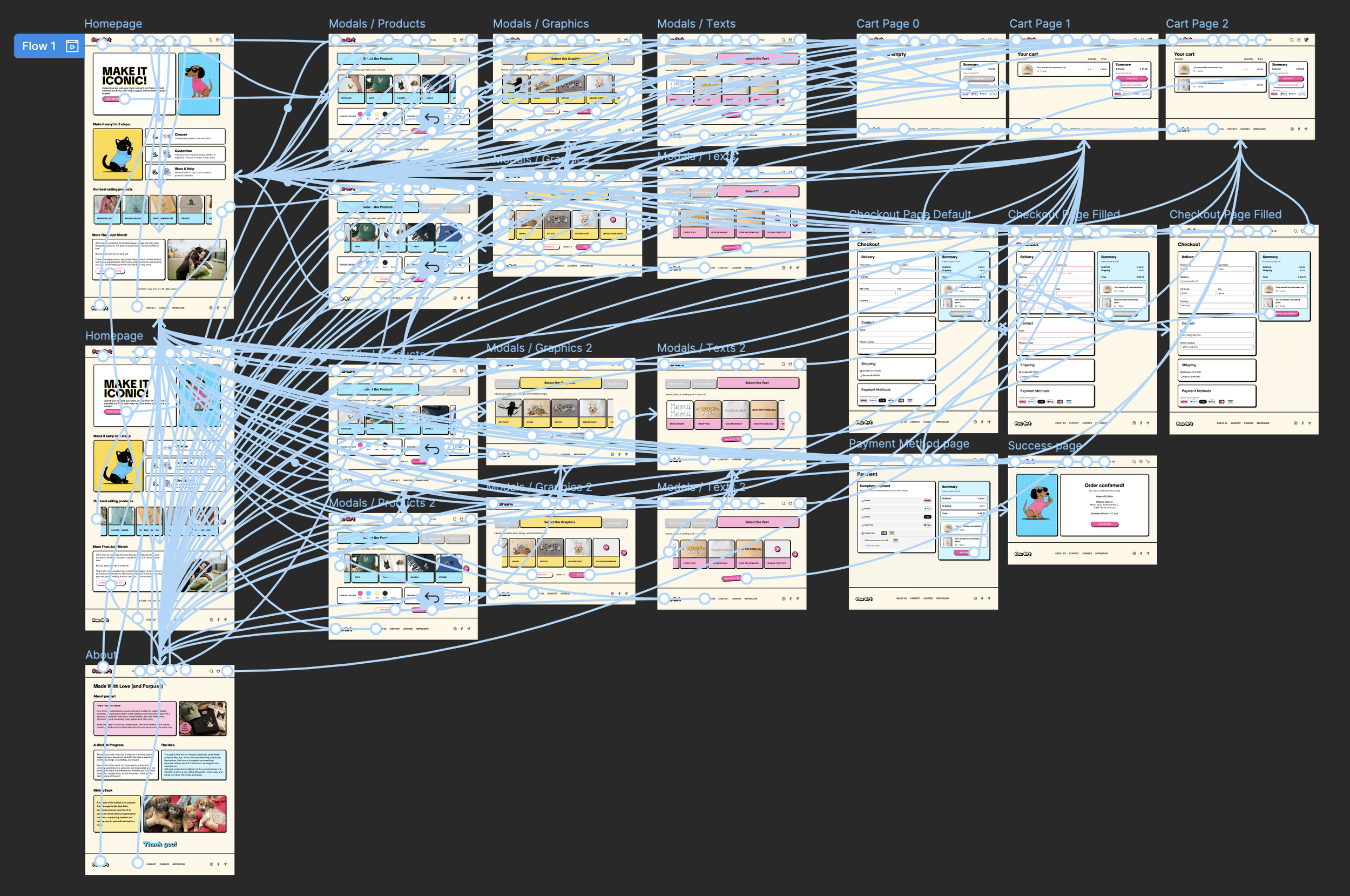
User Flow & Mid-Fi Wireframes
Before moving into polished visuals, I focused on structure, usability, and the overall user journey through mid-fidelity wireframes and user flow mapping.
The goal was to create a customization experience that feels simple, guided, and intuitive from start to finish.
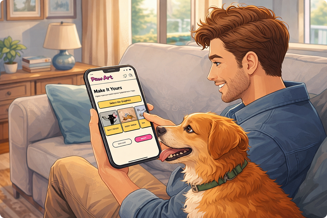
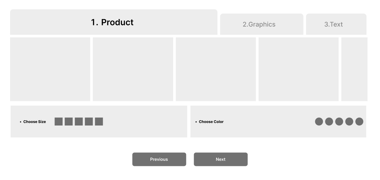
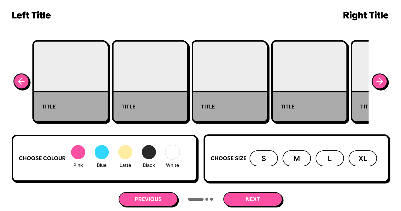
Users begin by selecting a product and customizing details such as size, color, and quantity. They can then personalize the product further by choosing graphics and text, either from existing options or by uploading their own content.
The experience was divided into clear stages:
Product selection
Graphic selection
Text customization
Preview & cart
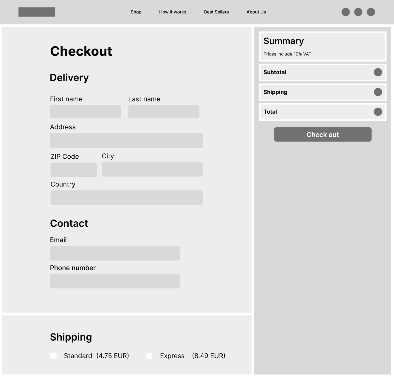
Checkout
Before purchasing, users can preview the final design, add the product to the cart, and proceed through either express payment or a standard checkout flow.
Breaking the process into stages helped reduce cognitive load, improve clarity, and keep users oriented throughout the experience.
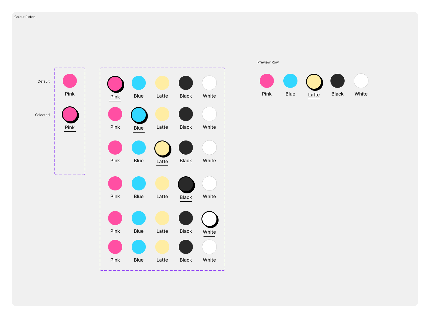

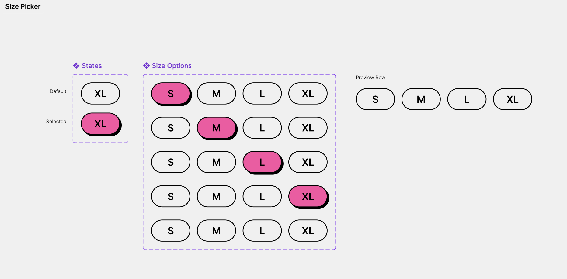
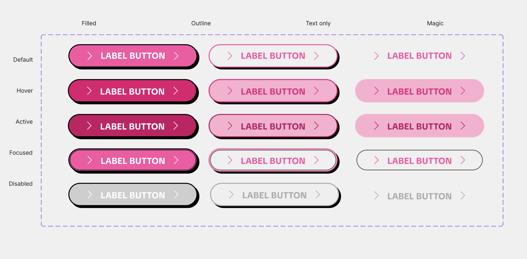
Components Library & Design System
Once the structure was validated, I developed a reusable component system.
This included:
Buttons
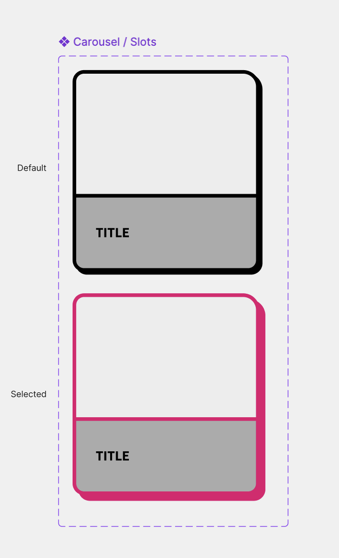
Product cards
Color selectors
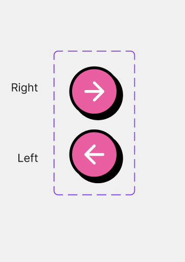
Navigation elements
Input fields
Icons
Carousels
Consistency across components ensured the platform felt cohesive and easy to navigate.
Interactive states such as hover effects, selections, and feedback animations helped make the experience feel responsive and alive.
High-Fidelity Design & Prototyping
After defining the structure and component system, I moved into high-fidelity design and prototyping to bring the experience to life.
At this stage, the visual language was applied across the full interface using bold typography, vibrant colors, playful imagery, and structured layouts. The goal was to create an experience that feels polished, expressive, and easy to navigate while maintaining emotional connection throughout the customization journey.
To make the platform feel more dynamic and intuitive, interactive prototypes and micro-interactions were introduced. These included smooth transitions, carousel animations, hover states, responsive buttons, and subtle feedback interactions that guide users naturally through the experience.
Combining visual design with interaction design helped transform the platform from a static interface into a more engaging and immersive product experience.
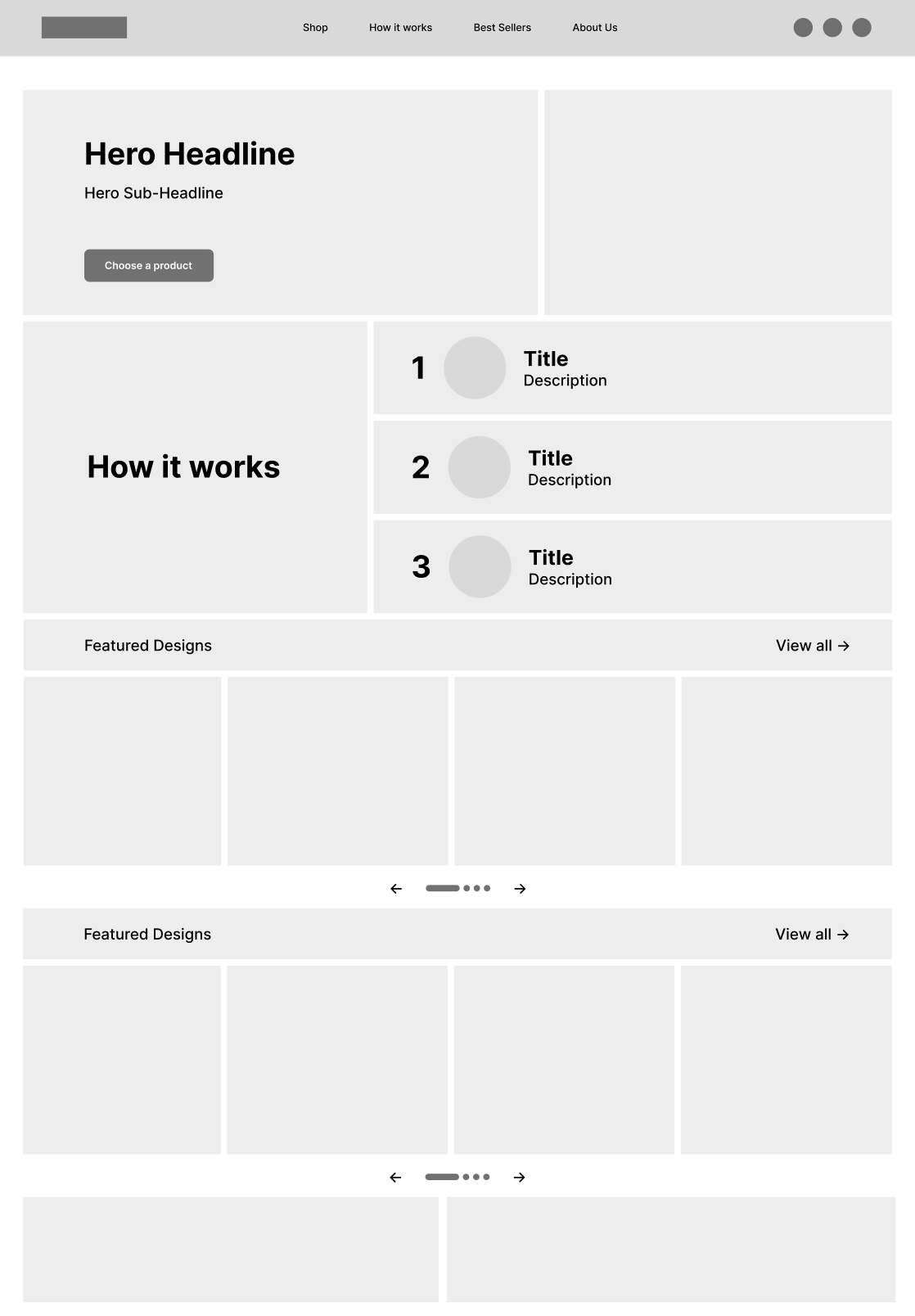
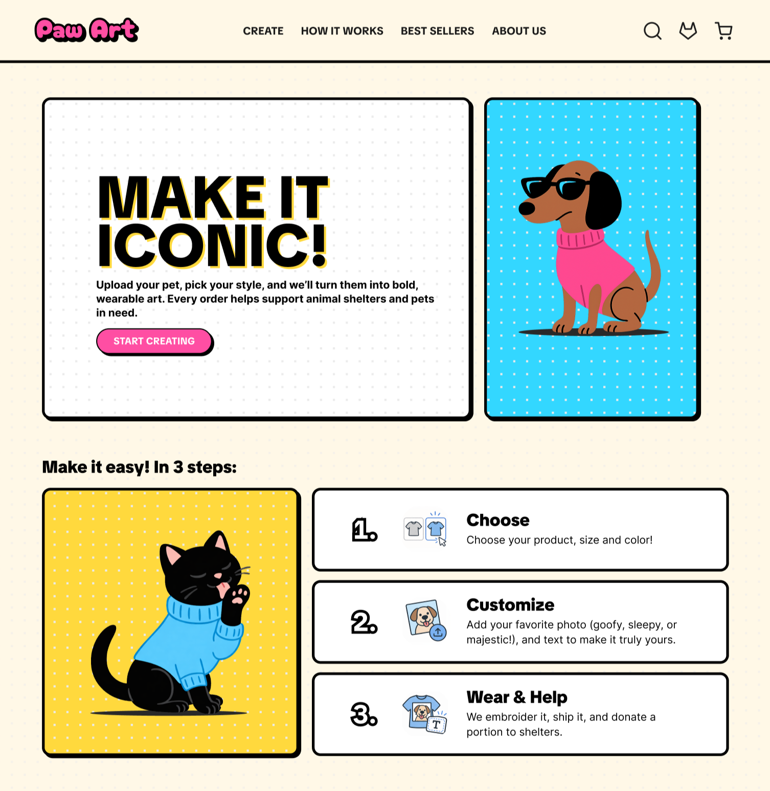
Homepage
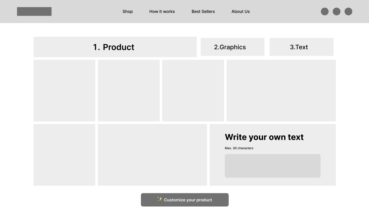
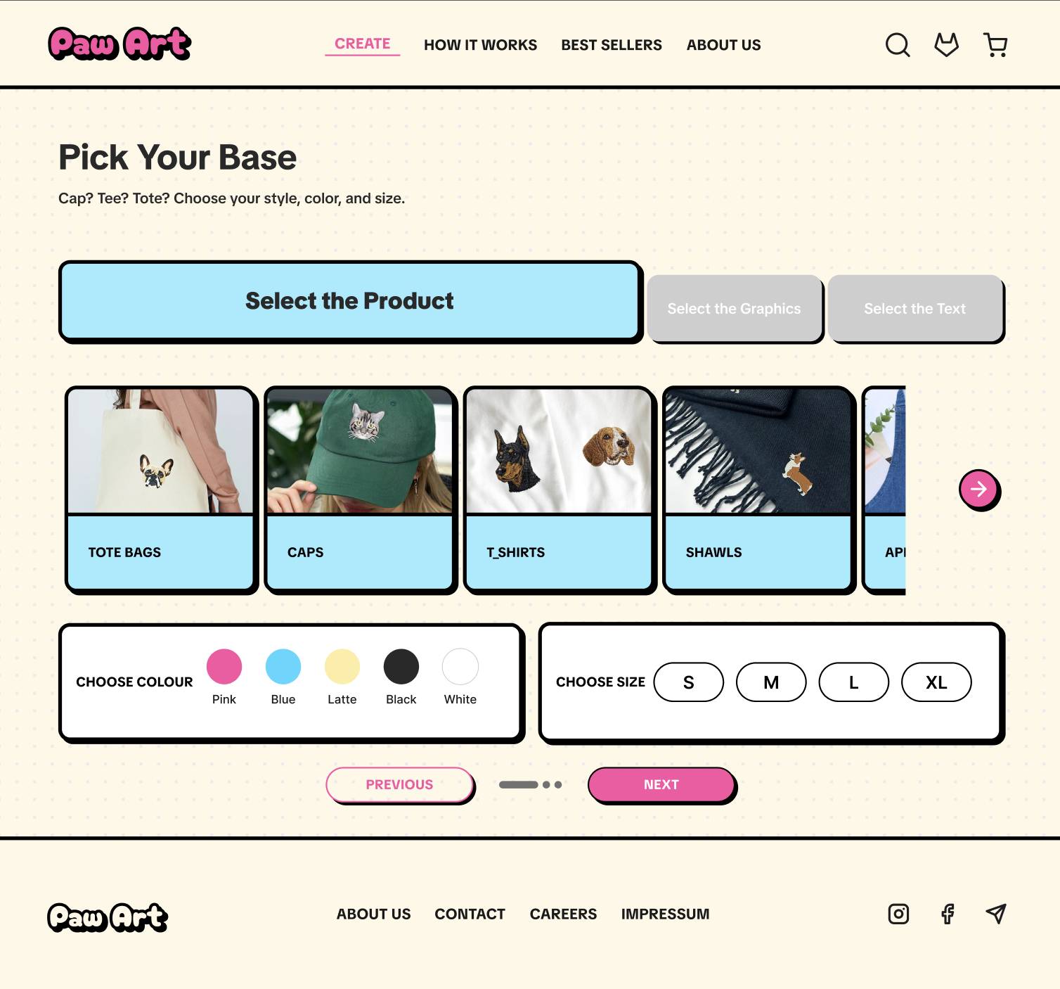
Create Page (Product Selection)
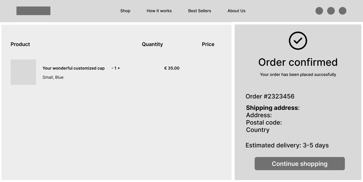
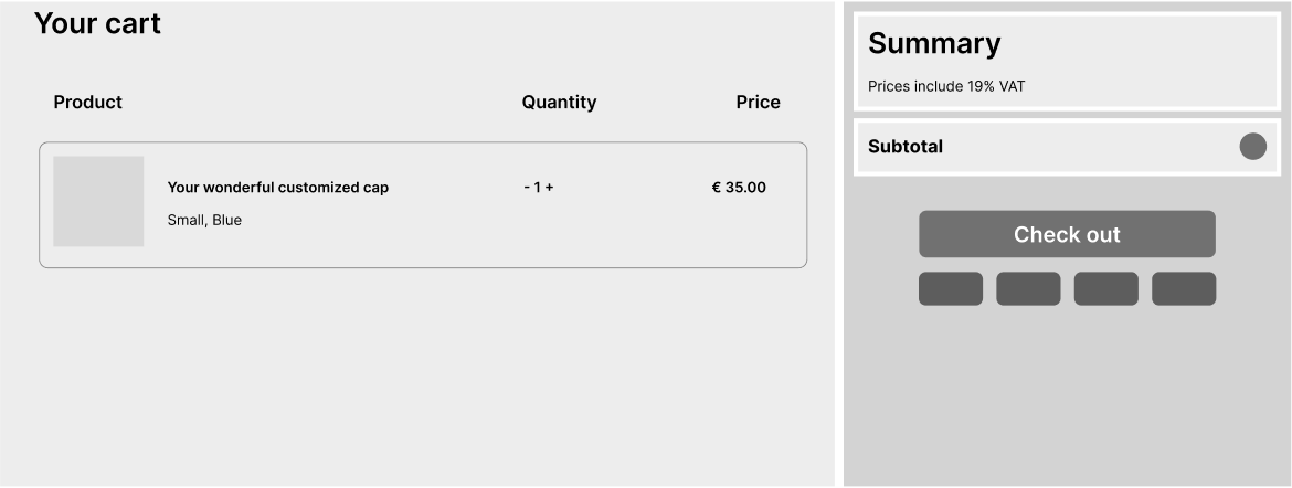
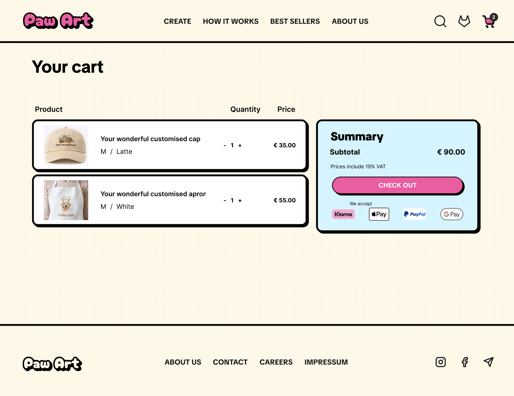
Cart Page
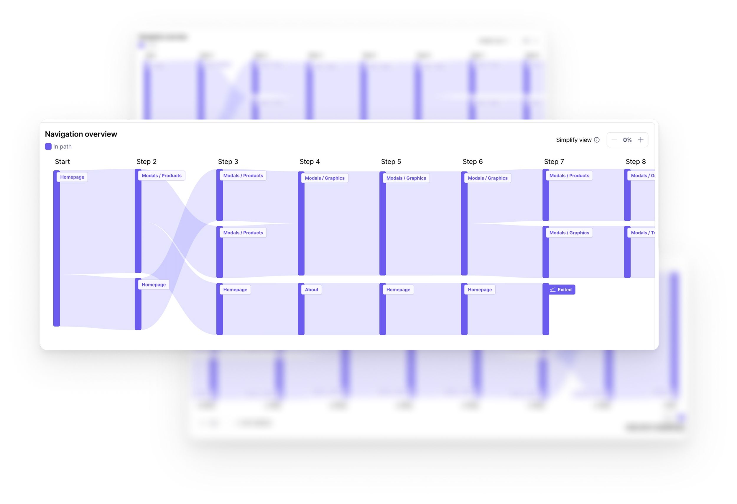
Usability Testing
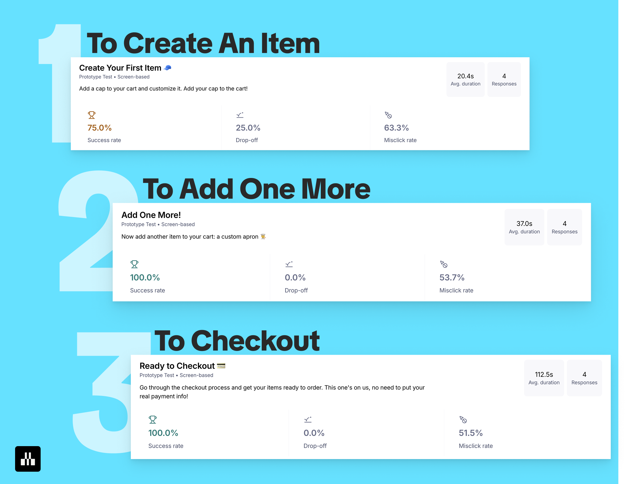
To validate the experience and identify usability issues, I conducted usability testing using Maze. The goal was to evaluate how easily users could complete key actions within the platform and understand where friction appeared throughout the journey.
The test included three main tasks:
Creating and customizing a product
Adding the second item to the cart
Completing the checkout process
The results helped measure success rate, drop-off points, task duration, and misclick behavior across the experience.
Overall, users were able to complete the core flows, especially during product customization and checkout. The testing also revealed areas where interactions could be clearer, particularly in sections with higher misclick rates. These insights helped identify opportunities to improve navigation clarity, interaction feedback, and flow guidance.
Conducting usability testing at this stage was important not only for validating design decisions but also for understanding how real users interact with the experience in practice.
Results Analysis & Learnings
After usability testing, I analyzed the results to identify recurring usability issues and interaction patterns. Based on the frequency and impact of each issue, findings were prioritized into high, medium, and low impact categories to guide the next design improvements.
The analysis highlighted areas such as navigation clarity, hidden actions, payment selection feedback, and product preview visibility. Prioritizing these insights helped focus the next iterations on the changes that would improve the overall user experience the most.
Final Outcome
The final result is an engaging and user-centered e-commerce experience that transforms customization into a creative and intuitive journey.
By combining structured layouts, clear interaction flows, expressive visuals, and responsive feedback, PawArt creates a platform that feels both functional and emotionally engaging.
Usability testing also revealed valuable insights for future iterations, helping identify opportunities to improve navigation clarity, interaction feedback, and overall flow efficiency.
Reflection
This project reinforced the importance of designing experiences that balance usability with emotional connection.
Through PawArt, I explored how visual hierarchy, interaction design, and user testing work together to shape intuitive and engaging digital experiences. The usability testing phase was especially valuable in validating design decisions, uncovering friction points, and guiding future improvements through real user behavior and feedback.