audibene homepage redesign
This was a project I recently completed for my current employer, audibene, a hearing aid company targeting baby boomers between the ages of 50 and 65. The challenge was to design a user-friendly interface that not only followed user-centered design principles but also reframed the brand as less medical and more lifestyle-oriented.
Redesigning the website involved a multi-step process to uncover user pain points and improve the overall platform experience. Through iterative testing, including multiple A/B experiments, we identified opportunities that significantly increased the conversion rate while reducing bounce rates. Alongside usability improvements, I redefined key corporate identity elements, optimized content, and implemented SEO best practices such as keyword strategy and clearer link structures to improve visibility in search engines and strengthen the company’s online positioning.
As the sole product designer on the app development team and the first designer the company had had in over a year and a half, I also took on the responsibility of re-establishing design practices within the product process. This meant laying critical groundwork, from creating a sustainable design system to advocating for user-centered methods, ensuring design once again became an integral part of product development.
This is an interactive prototype, you can expand and scroll through the page
Design System
The first priority was to create tools that could empower the entire team. The design system became our single source of truth, ensuring both visual and language consistency across products. Although we initially had outdated Sketch files, I rebuilt the system in Figma and, with support from developers, brought it fully up to date.
This gave every role tangible value: the Product Owner gained visibility, hands-on drafting tools, and reliable references for discussions with stakeholders and developers; Developers and QA had clear documentation and a dependable standard to align with; and I gained robust tools for producing high-fidelity designs while maintaining brand governance.


Accessibility and branding
Font & Spacings
After a long period without dedicated designers, the team placed special emphasis on building lasting documentation, open and accessible files, and multiple reference points! In short, creating a reliable memory for posterity. The guiding principle was future-proofing: ensuring that the design system could evolve without losing its structure or clarity. To support this, I implemented a file-based versioning system rather than a component-based one. This lightweight approach allowed us to track the evolution of components effectively while keeping the workflow simple and sustainable, especially since maintenance fell solely on me.
For typography, I selected Museo Sans Rounded for headers and Museo Sans for body text. The rounded variant adds warmth and approachability, reflecting the brand’s friendly, user-centered voice. In contrast, Museo Sans provides excellent legibility, clarity, and a modern aesthetic, making it ideal for longer texts and interface elements. Together, the two typefaces create a balanced hierarchy that feels both approachable and professional, ensuring consistency and readability across all platforms.


Colour Palette
When I developed the company’s design system, not only did I want the color palette to do more than just look appealing, but it had to communicate the brand’s values and work seamlessly in digital products. I started by anchoring the palette in shades of blue, since blue conveys trust, clarity, and professionalism, which aligned perfectly with the company’s positioning. By creating a range from dark to light, I ensured flexibility for hierarchy, accessibility, and contrast in both UI and marketing contexts.
From there, I introduced a secondary palette to support functionality and expression. Yellow was chosen as an accent to guide attention and highlight actions, while grays provided neutrality for balance and readability. Green and red were incorporated for their strong associations with success and error states in interfaces, ensuring that users can intuitively understand system feedback. Finally, violet offered an additional distinctive highlight for storytelling and data visualization.
This combination resulted in a palette that is not only consistent and recognizable but also highly practical for real-world applications across digital and print.


From left to right: Old interface elements vs new ones
Intro / Call to Action / Value Proposition

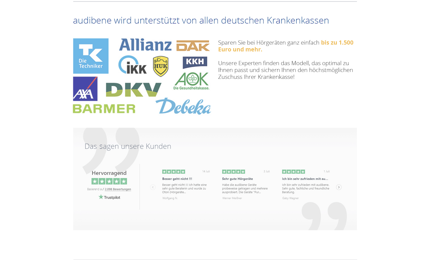
Trust Points / Interactive Elements


Internal Links / Footer


