Beyond the homepage and our main product page at Audibene, the company had over a hundred additional pages ranging from organic and informational content to manufacturer and product-specific pages, scattered across the web. However, there was no centralized archive or structure to organize this content in one place. Together with the SEO and Development teams, I led the effort to consolidate these pages, categorize them by topic relevance, and make the content easily accessible for users. This not only improved navigation and discoverability but also strengthened the overall user experience and search visibility.
Context
We were tasked with creating four hub pages for the company’s most important topics and restructuring the existing informational pages to replace the outdated drop-down component.
At the time, no documented user research or validation existed for this feature. However, through close collaboration with our customer consultants, we discovered that many customers struggled to find the information they were looking for.
Additionally, the existing feature suffered from poor alignment with the company’s corporate design, leading to both visual inconsistencies and functional usability issues.
Actions Taken
Conducted surveys and usability tests to identify and document the main user pain points.
Improved the information architecture to reduce cognitive load and make page objectives clearer.
Organized topics into clear, accessible categories to encourage deeper engagement, increase time spent on the page, boost click-throughs, and reduce bounce rates.
Aligned the visual design of the hub pages with the homepage and overall brand guidelines to ensure consistency and trust.
1. Research and exploration
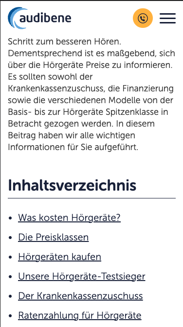
In the previous page design, we utilized an accordion component to display the topics most closely related to the primary subject of the page. As part of a broader initiative to obtain an updated overview of this component, we systematically captured screenshots of each page implementing this feature and documented them in a Figma file. Within this file, the screenshots were organized to reflect the user flows and navigational journeys across related pages.
Concurrently, we revisited and redefined our key topics and their associated subpages. This effort aimed to eliminate redundancy across categories and improve navigational clarity, thereby enabling users to access a diverse range of topics more efficiently.

To evaluate the effectiveness of visual communication and information hierarchy, we conducted a variant of a usability test, extending a traditional 10-second test to a 40-second exposure. Participants were drawn from our target demographic (English-speaking adults aged 60+). Insights from this test revealed that pages containing multiple related topics exhibited a constrained reading order, and the minimal wording hindered comprehension.
Subsequently, we conducted an additional usability test to assess interaction across different device sizes. Findings indicated that on smaller mobile screens, the feature’s usability was compromised, as a significant portion of topics remained off-screen, reducing visibility and accessibility.
Overall, these research efforts highlighted key limitations in content discoverability, readability, and mobile responsiveness, providing actionable insights for iterative design improvements.


First usability test: Users were tasked to first find the category Höverlusterkennen and then the topic Audiogramm.

2. Definition of pain points
The test results and subsequent analyses were systematically documented on Confluence, shared with the team, and discussed collaboratively. Additionally, participant responses were organized on a Miro board, and an affinity mapping exercise was conducted, facilitating the identification of recurring patterns and key themes in user feedback.
Through team discussions of these findings, we were able to pinpoint the primary issues faced by our users and reach consensus on which problems should be prioritized for resolution. While testers demonstrated confusion regarding the overall functionality of the feature, certain visual cues, such as hyperlinks within the text and navigation arrows, were consistently recognized and understood with ease.
However, users frequently perceived that the displayed topics did not meet their informational needs, making it difficult for them to locate desired content. When confronted with a lengthy list of topics presented only as text, users often abandoned the page before reaching the end, indicating low engagement and contributing to a higher bounce rate.
Furthermore, the insufficient spacing between links, particularly on mobile devices, led to frequent misclicks, directing users to unintended pages and generating additional confusion and distraction. These findings underscore the need for improved information hierarchy, visual separation, and interactive clarity to enhance overall usability and user satisfaction.
3. Drafting and testing
After identifying the primary pain points, we developed well-defined design concepts, which facilitated direct exploration through mid- to high-fidelity mockups.
The visual exploration explored multiple directions, but the key design objectives were clear: improve the visual categorization of related topics, simplify and make the search process more engaging, enhance navigation through directional elements such as arrows and interactive components, and maintain proximity between categories while ensuring sufficient separation between topics and subsequent sections for better readability.
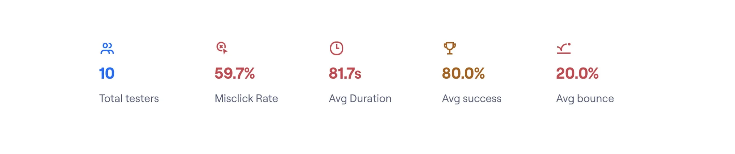
We conducted a preliminary usability test similar to the initial study and were encouraged to find that the first design iteration was noticeably easier for testers to understand. Completion rate and average task duration were used as the primary performance indicators. Building on these insights, we then executed a more extensive usability test comparing both the implemented design and the redesign. This allowed us to evaluate the recent changes while also directly comparing the two designs from the user perspective.
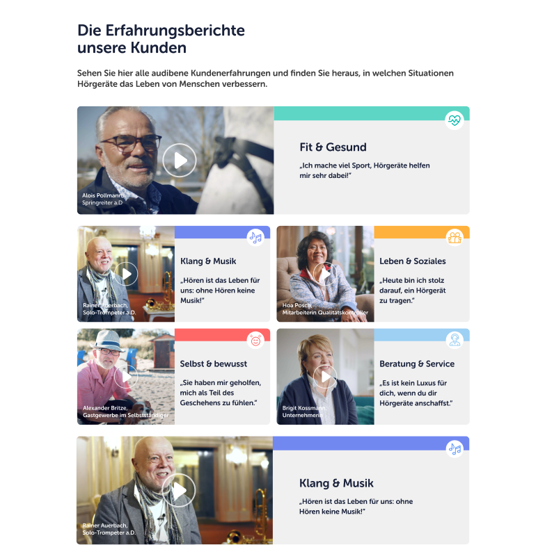
Despite replacing drop-down menus with carousels, feedback from the CRO team highlighted that our target demographic struggles to interact with carousel components, particularly on mobile devices. Placing navigation arrows at the edges of the screen increased the likelihood of accidental clicks.
Additionally, we observed that the use of images depicting negative emotions, such as sad faces or individuals in pain, significantly reduced click-through rates. This was particularly relevant for pages addressing topics such as ear diseases, underscoring the importance of carefully considering the emotional impact of imagery on user engagement.


Final usability test: users were tasked with finding the section Alltag mit Hörgeräten and then Hörgeräte einsetzen. They could finish the tasks in any order. Underneath the summary report from maze.co.
4. Delivering a user-centered solution
At this stage of the process, the redesigned interface had been validated as a clear improvement over the previously implemented version, providing a demonstrably better user experience.
While we had achieved a successful solution, we implemented a final interface adjustment to further elevate the design quality. This refinement strengthened the visual and functional relationships between sections, subpages, and interactive elements, including components such as the video carousel.
To ensure these last adjustments maintained the improvements achieved so far, we conducted a 40-second comparative usability test. The results were positive: the final iteration performed as intended, and testers consistently indicated a preference for the latest design.
Examples of newly designed section for informational, product and video hub pages