CRTD: Berlin
2026 · Product Design · AI-Driven Design · Neue Fische
Overview
A unified cultural companion for Berlin. One app to discover, book, and experience the city's museums. No fragmented portals, no lost tickets, no missed exhibitions.
App Design | iOS Mobile

The Problem
Berlin has world-class museums. Finding them is a chore.
Museum visitors in Berlin navigate a genuinely fragmented landscape. There is no single source of truth for what is on. Every institution has its own website, booking system, and often its own app. The experience that should feel like spontaneous cultural discovery ends up feeling like project management.
What needed change
We started with secondary research and competitor analysis: museum-companion apps, ticketing marketplaces, and local Berlin portals. The landscape confirmed what we suspected. No existing product unifies discovery, ticketing, and the on-site experience. The eight competitor categories all solve one piece of the problem; none solve it together. A 23-person online survey validated the secondary research. Six qualitative interviews, 30 minutes each, revealed what to actually build. Three problems rose to the top, confirmed across all six interviews we later ran.
-
No single source covers all Berlin museums. Users juggle newsletters, Instagram, word of mouth, and individual museum sites, with no reliable overlap between them.
-
A new account per institution, confusing ticket types, and unknown advance booking requirements. 26% of survey respondents rated ticket clarity at 1 or 2 out of 5. 9% did not know the Museum Pass Berlin exists.
-
Every single interviewee photographs artworks as their primary memory tool. Every single one finds those photos useless afterwards, unlabelled, out of context, lost in the camera roll. Interestingly, that was the finding we hadn't planned for which changed the product a lot.
From research to hypotheses
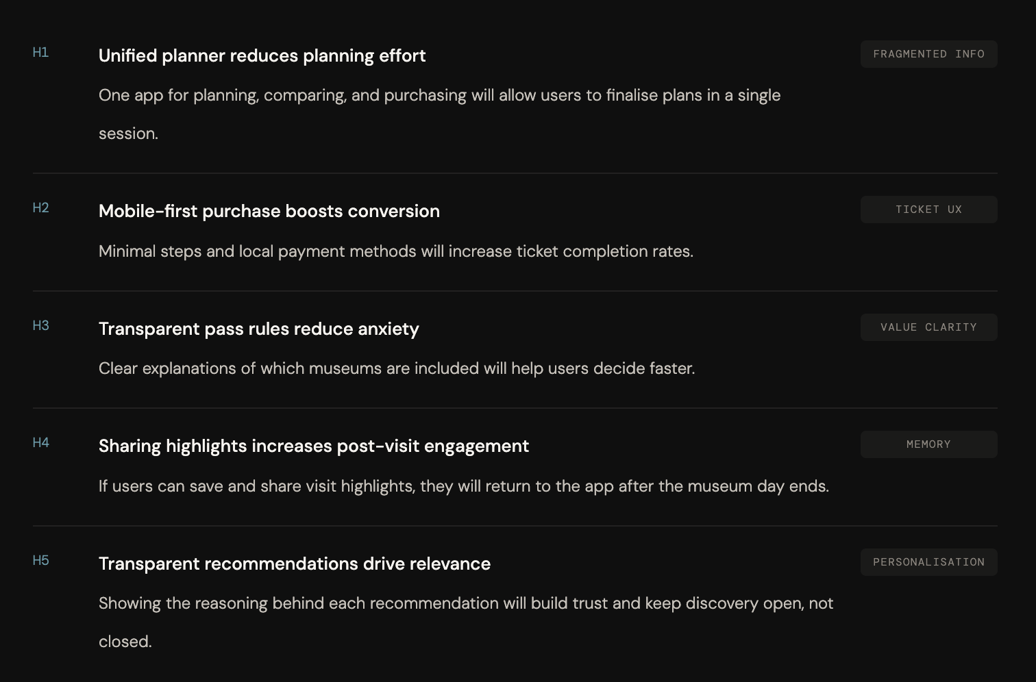
The research gave us problems. The How Might We questions turned those problems into opportunities. The hypotheses turned those opportunities into something we could test through design.
After synthesising the survey and six interviews through affinity mapping, three pain points emerged clearly. But pain points don't tell you what to build. We ran HMW workshops across three research theme clusters to reframe each problem as a design space, not "users miss exhibitions" but "how might we make sure they never miss something worth visiting?" Not "photos get lost" but "how might we turn visit photos into meaningful memories with zero effort?"
The HMW questions opened up the solution space without prescribing features, keeping us focused on user outcomes rather than interface decisions. From six HMWs, we generated 19 hypotheses, then prioritised five by cross-referencing severity and frequency from the research with how directly we could address each need through a mobile app. Each maps to a specific product surface. They were not formally tested at this stage, but every design decision in the prototype was made with a hypothesis in mind, so when testing happens, we know exactly what we are measuring and why.
Persona
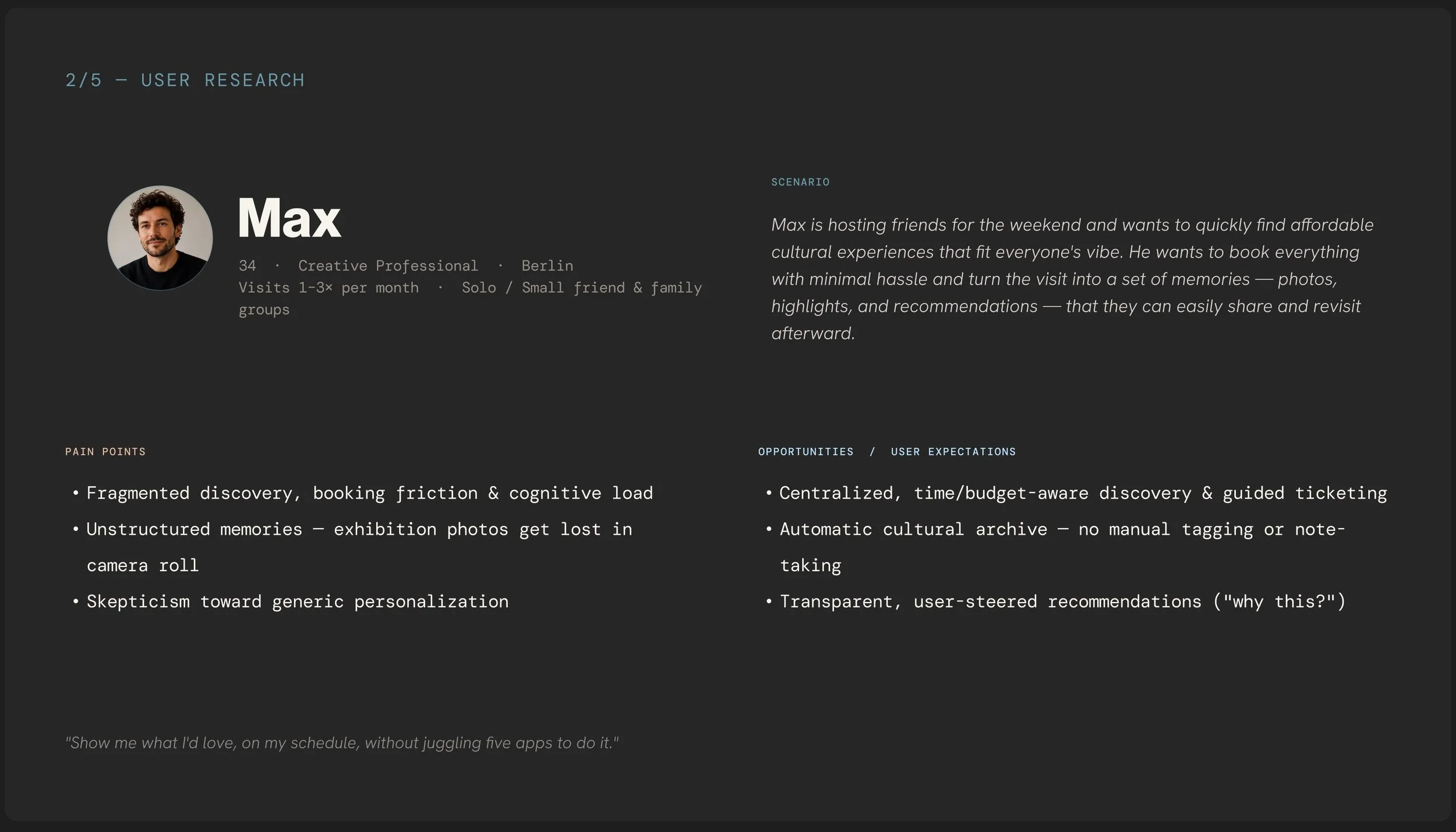
With six interviewees covering different visitor types- tourists, creative locals, a parent, and a spontaneous social visitor, we needed a single composite that captured the most common patterns without flattening the differences. Max is that composite.
He is 34, a creative professional living in Berlin, visiting museums one to three times a month. He plans spontaneously, often deciding within 24 hours. He visits solo or with a small group of friends. He is digitally comfortable but has low tolerance for unnecessary friction. Creating a new account just to buy a ticket is enough to make him not go.
What makes Max useful as a design tool is not his demographics but his tensions. He wants recommendations tailored to his taste, but not a filter bubble. He wants to document what he sees, but the camera roll system consistently fails him. He wants to book quickly, but every museum puts a different obstacle in the way. Those tensions drove the feature decisions more than any single data point.
User journey map
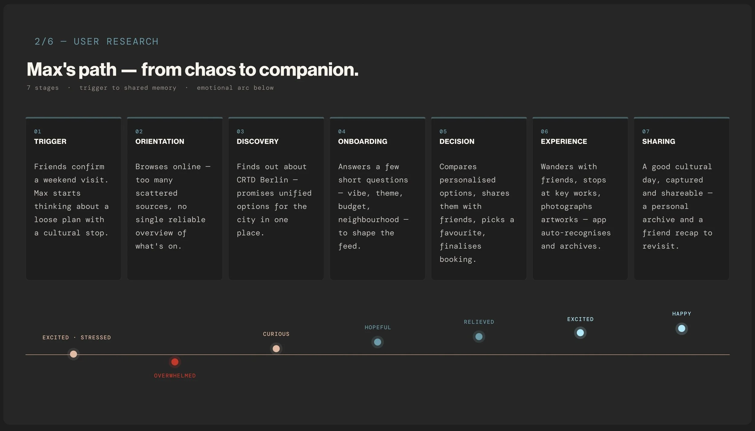
The journey map traces Max's experience across seven stages, from the initial trigger to sharing the memory afterward. We mapped not just the steps but the emotional arc underneath them.
He starts excited but stressed when friends confirm they are visiting. He becomes overwhelmed in the orientation phase, with too many scattered sources and no single reliable overview. Curiosity arrives when he discovers CRTD. He moves through hopeful during onboarding, relieved once the booking is confirmed, and excited on the visit day itself. The arc ends at happy, when he can share what he captured with the people he went with.
That arc from overwhelmed to happy was the clearest brief the research gave us. Every design principle, every flow decision, every screen was measured against it: does this move Max forward on that arc, or does it push him back?
Design Principles
A cultural companion, not a ticketing utility.
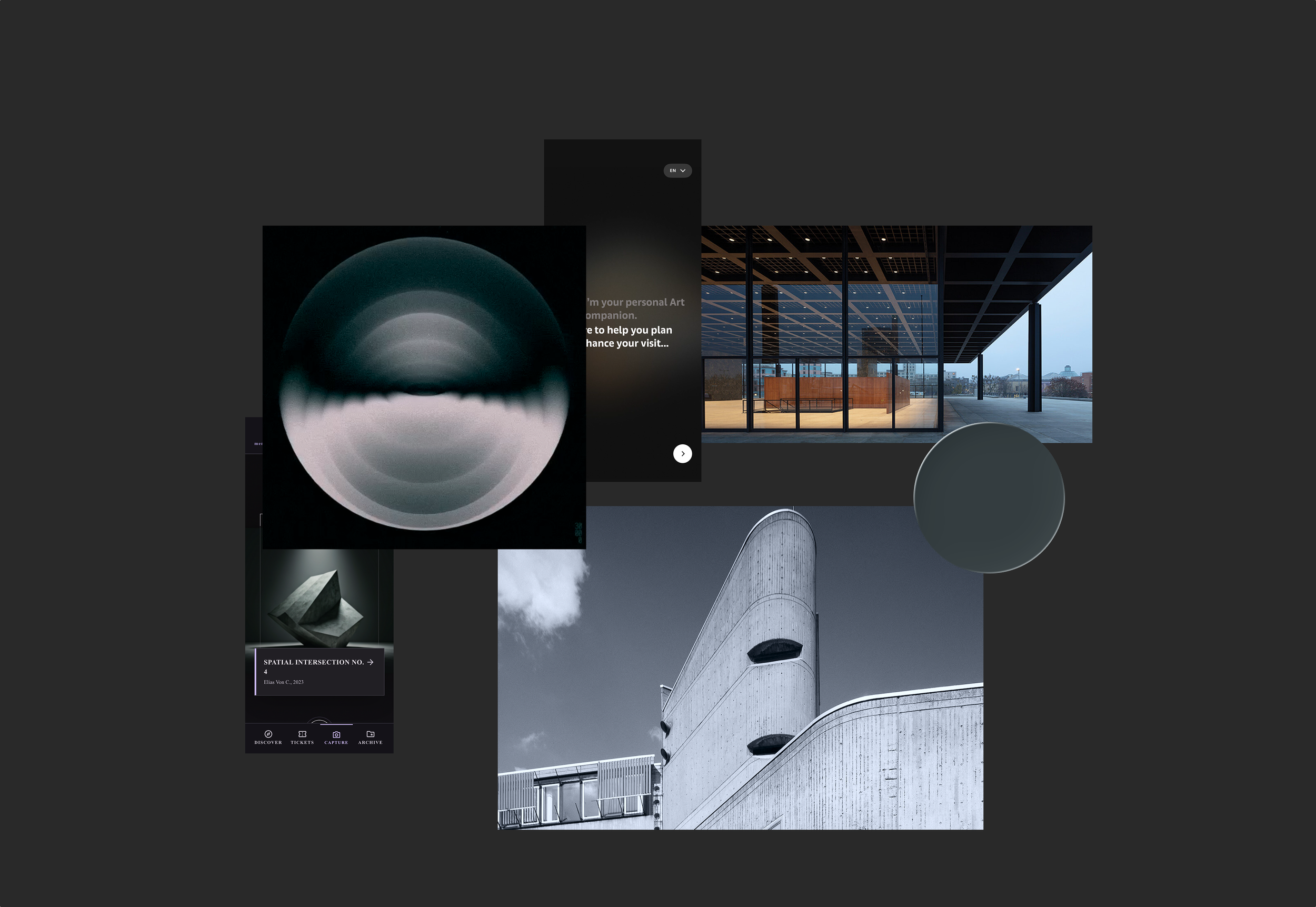
Five design principles shaped every decision before a single screen was drawn. The goal: something closer to a well-designed city magazine than a booking platform.
-
The UI steps back. Museum imagery does the selling. No hero banners, no "Book now!" CTAs.
-
Every recommendation shows its reasoning. Users encounter things they didn't know they wanted, but trust that it was earned, not gamed.
-
No countdown timers, no urgency banners. Animations slow and intentional. Berlin's museum culture is contemplative, the app should feel the same.
-
Save = single tap. Booking = deliberate 3-step flow. The effort difference tells users which actions are reversible.
-
Personalisation is always explainable. "Why this?" on every recommendation. Empty states honest, not branded.
Visual
Language
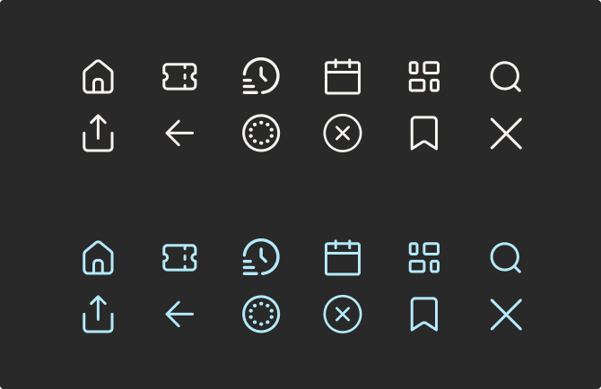
Iconography
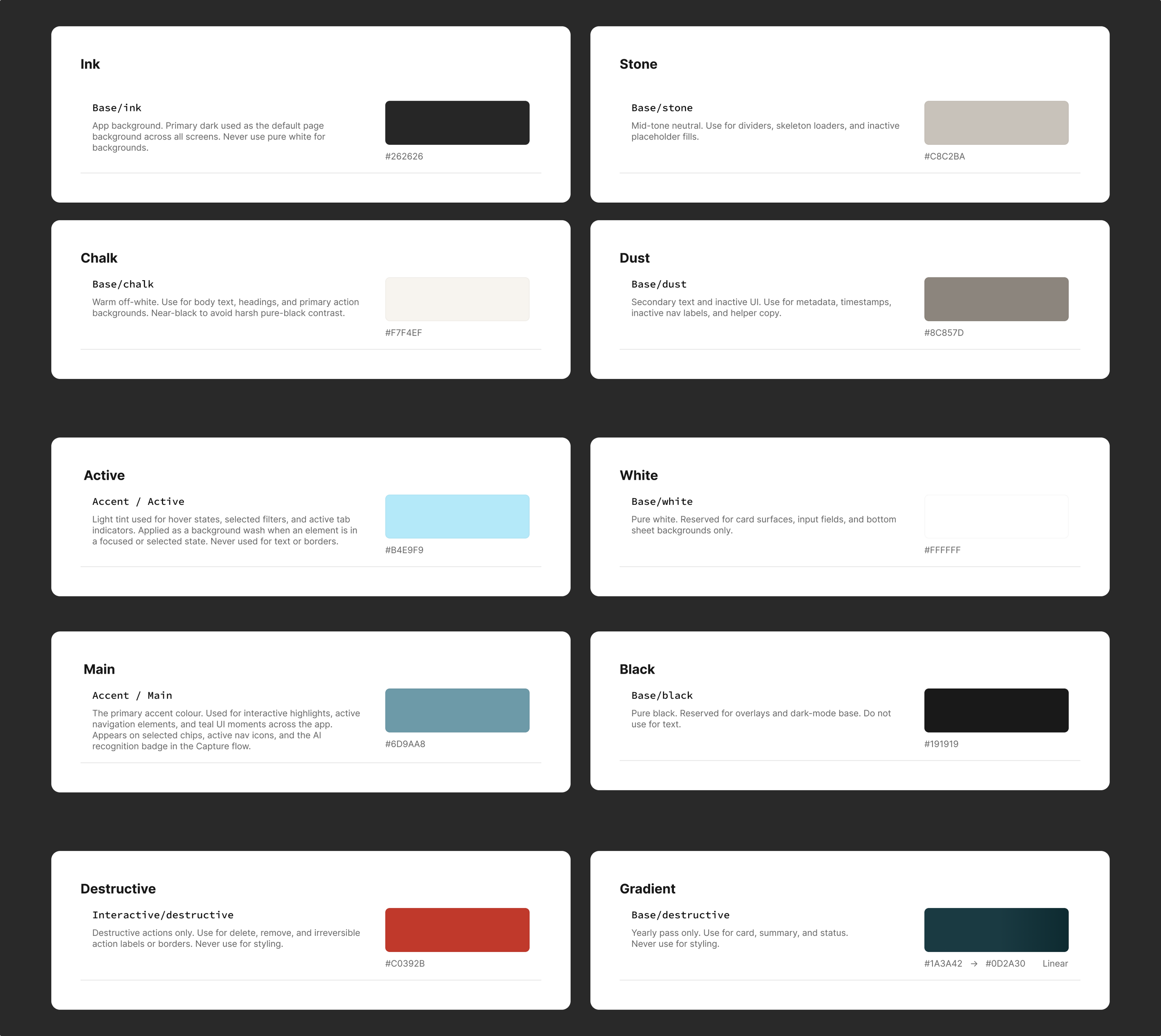
Colors
Typography
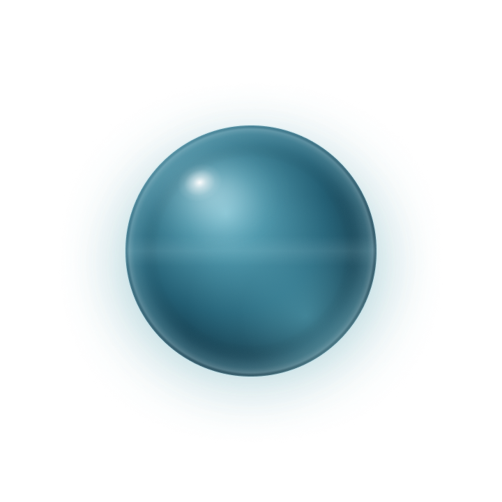
App Logo
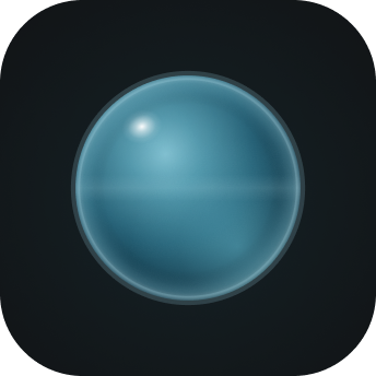
App Icon
Key Design decisions & Flow Chart Mapping
01. Onboarding as a conversation
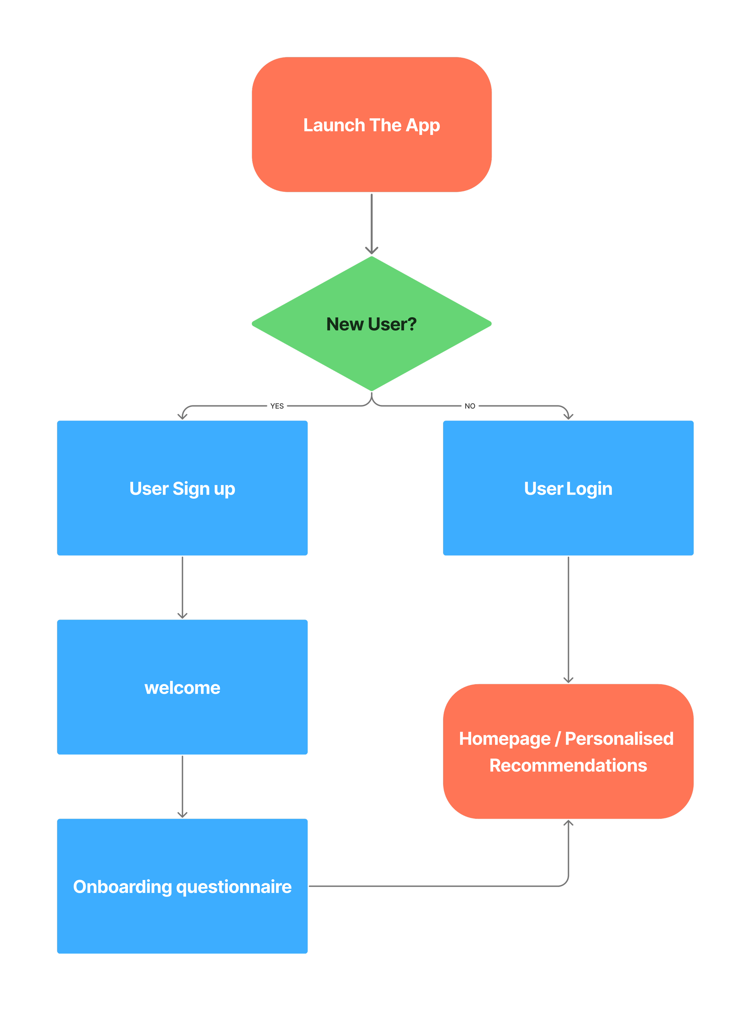
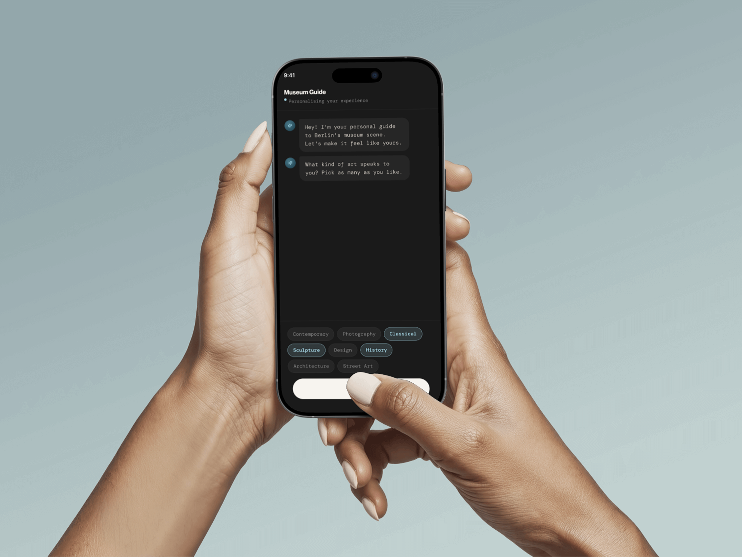
Because 74% of users decide within 24 hours, there is no time for a traditional preference setup. A conversational Museum Guide replaces form fields, it asks what kind of art speaks to you, allows location, connects friends, and builds the personalised feed in minutes. Zero configuration overhead.
03. One wallet across all institutions
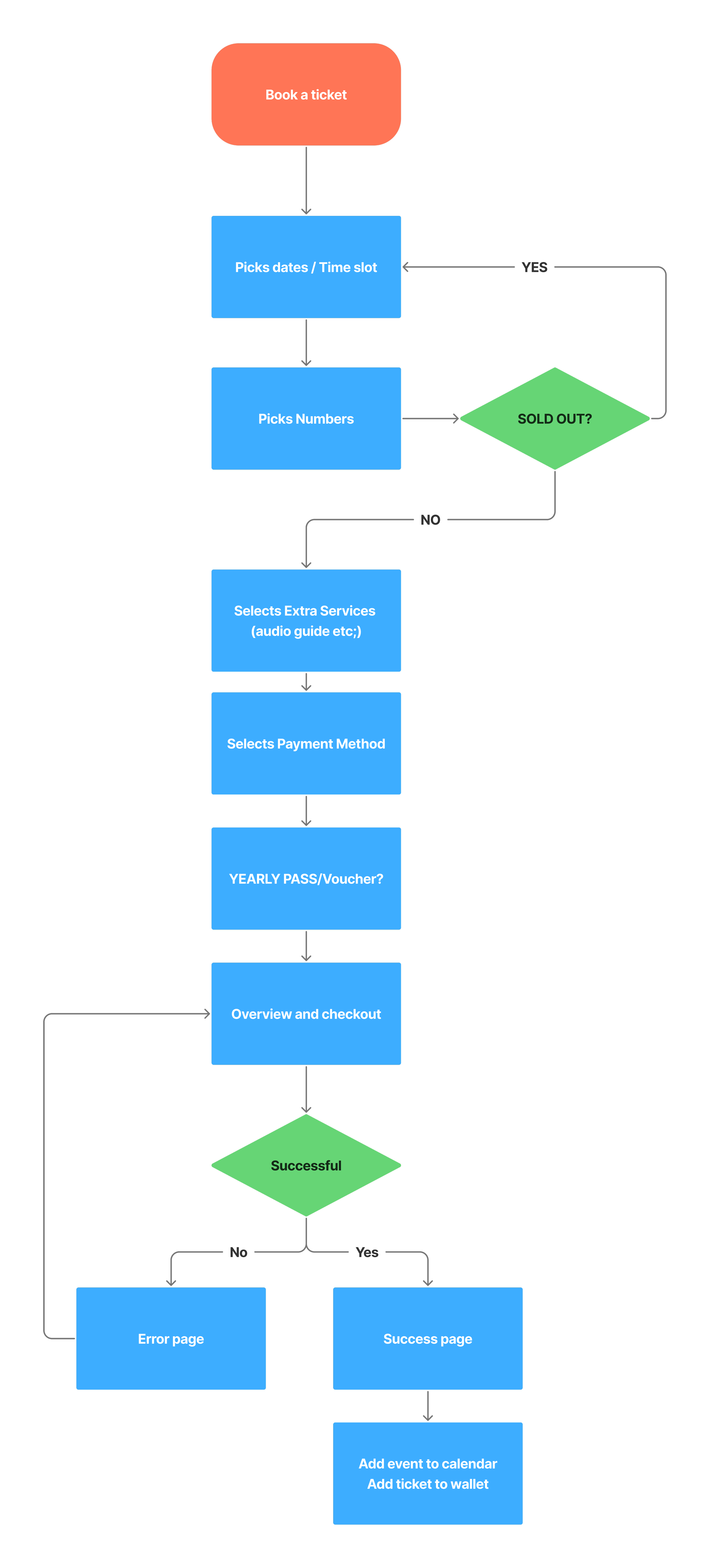
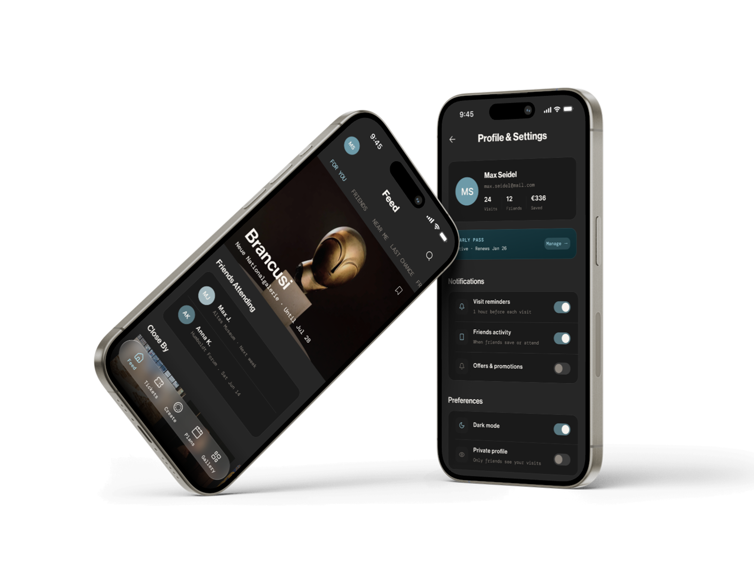
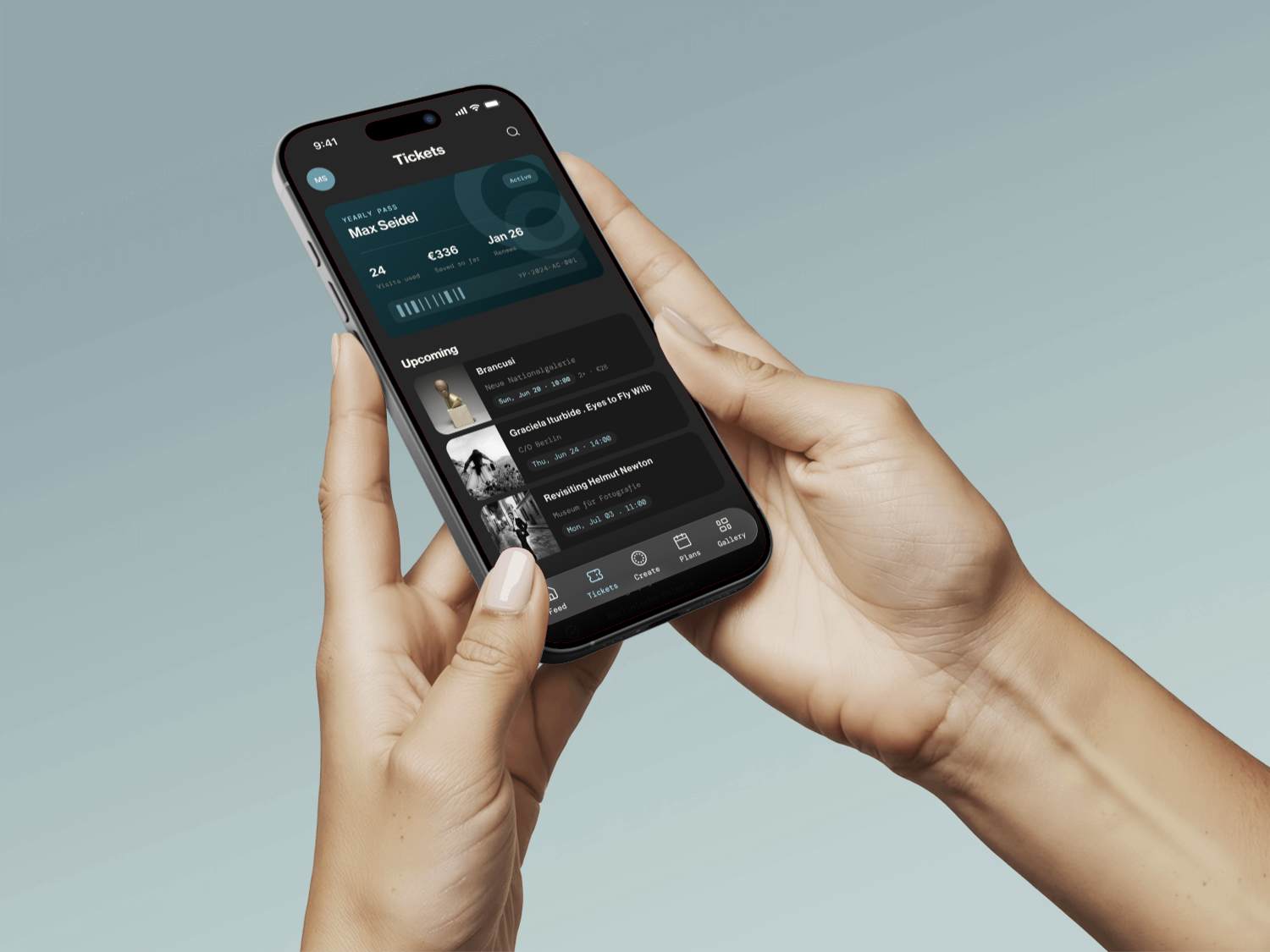
All tickets, QR codes, and the Yearly Pass land in a single screen. No per-institution accounts, no hunting through email. The booking flow is exactly three steps: Date and Time, Ticket Type, Order Summary and then one Apple Pay tap. This directly solves the highest-frequency pain point from the survey and all six interviews.
02. Recommendations that show their reasoning
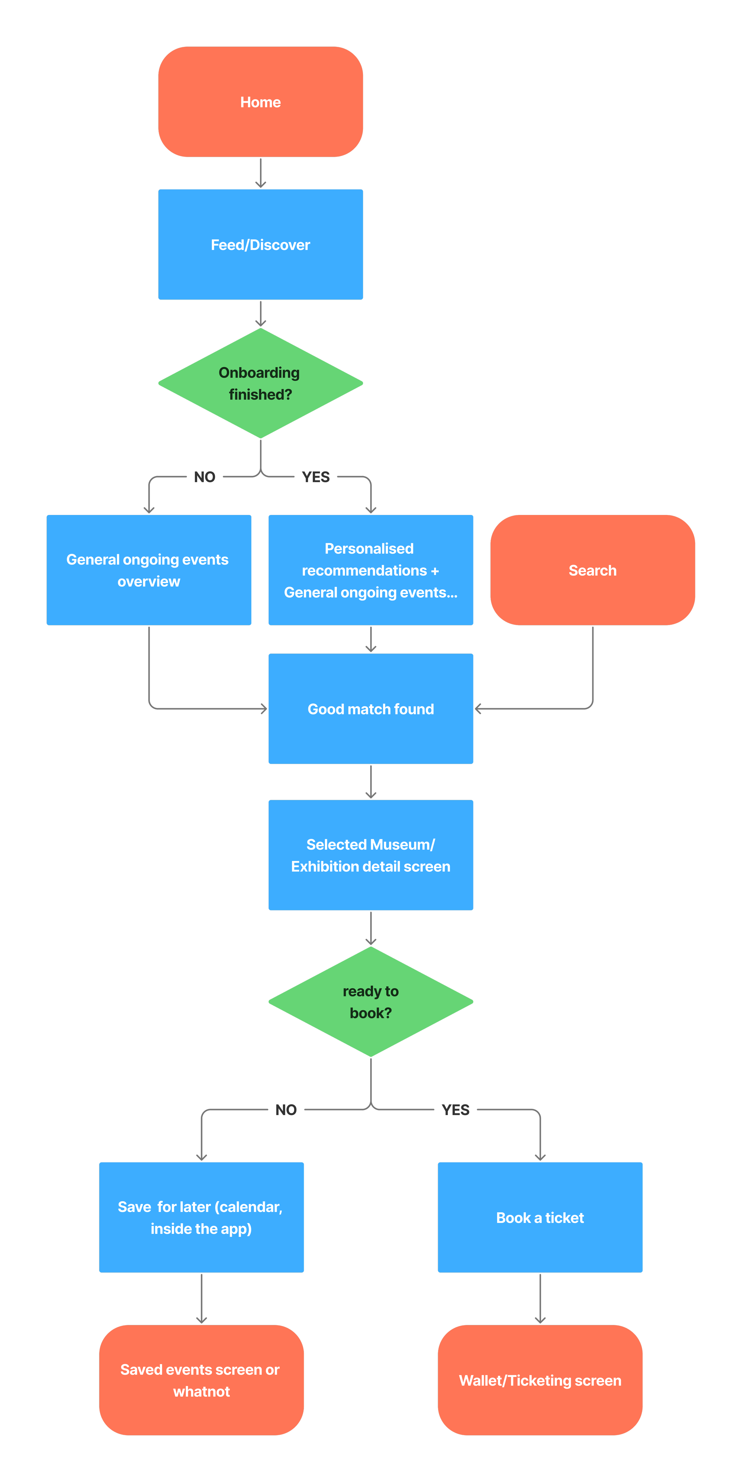
Four of six interviewees raised the filter bubble concern unprompted. Every card carries a plain-language reason: "Because you liked Photography", "3 friends are going", "Ending soon near you". The feed always includes broader content too, so users are never trapped in their own taste profile.
04. Capture, the feature the research demanded
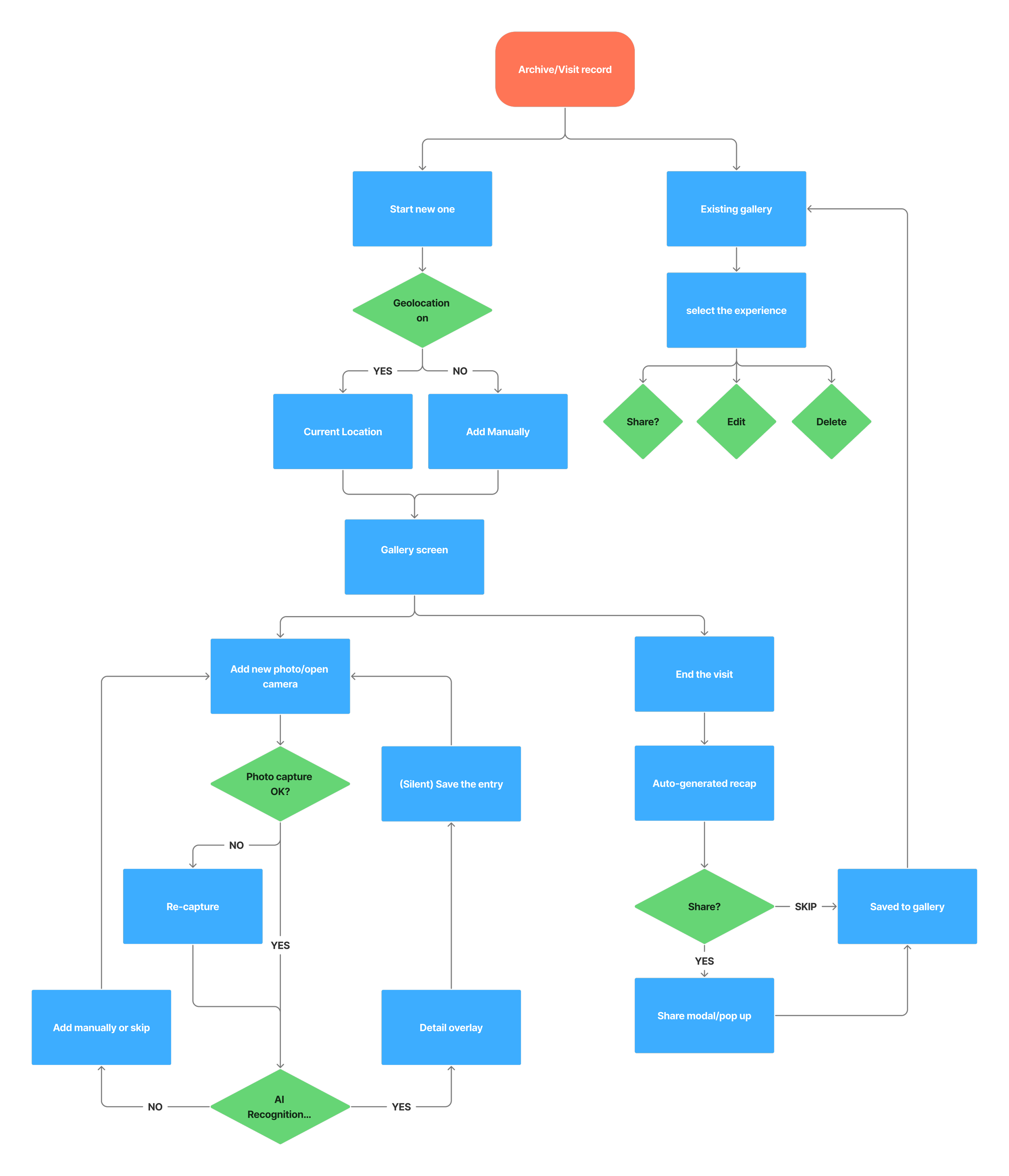
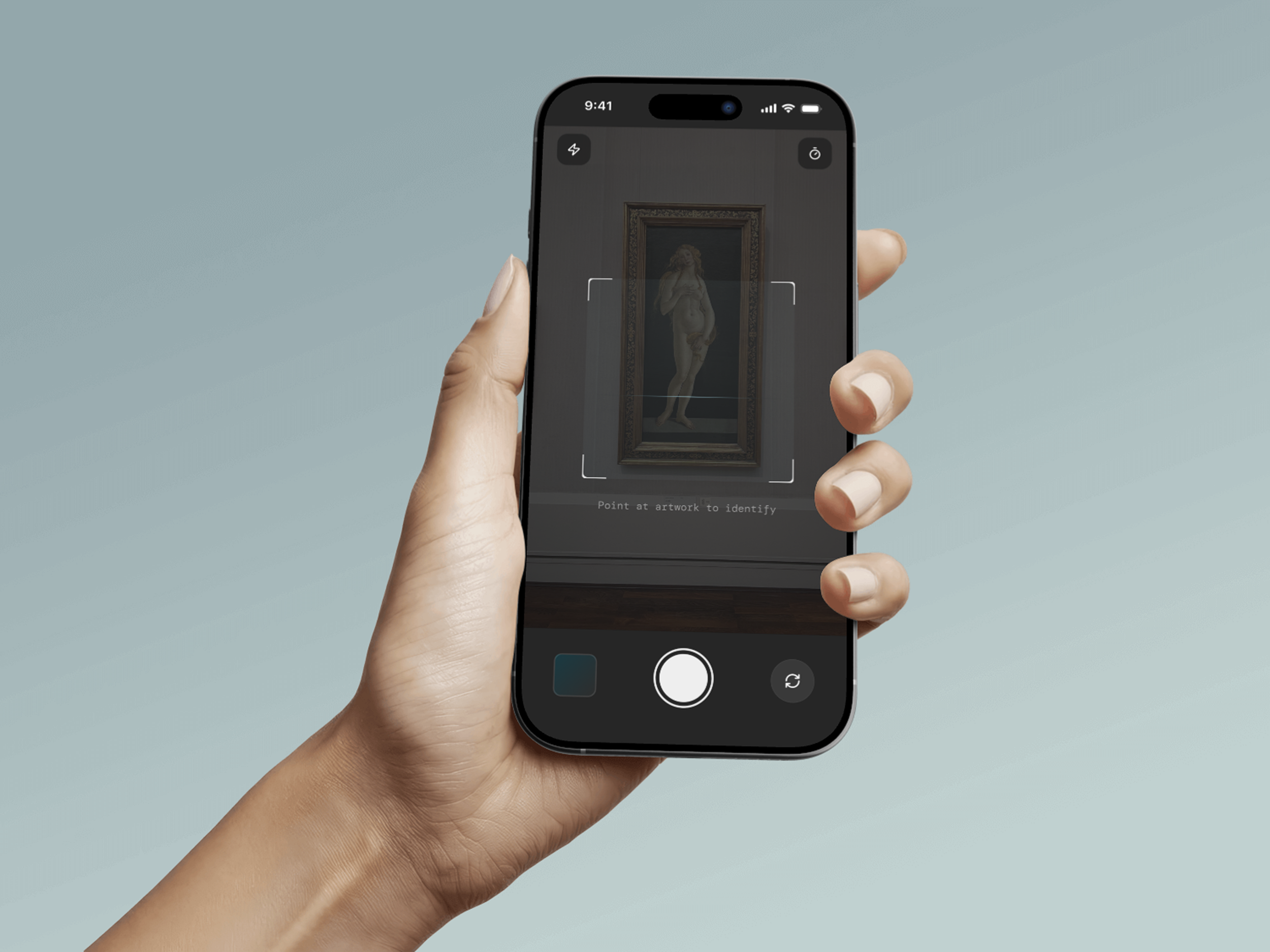
The unanimous memory finding led here. "Point at artwork to identify." The Create tab puts a camera in the nav bar. AI recognition identifies the artist, title, and museum automatically. At the end of a visit, End Visit generates a named, contextualised recap. 14 captures, 11 identified, AI-generated summary, shareable with friends. Artwork photos become cultural artifacts, not anonymous pixels.
Wireframes & Component Library
Wireframing and building the component library happened in parallel rather than in sequence. As soon as a pattern repeated across screens- a card, a bottom sheet, a nav state- it moved straight into the library instead of being redrawn each time.
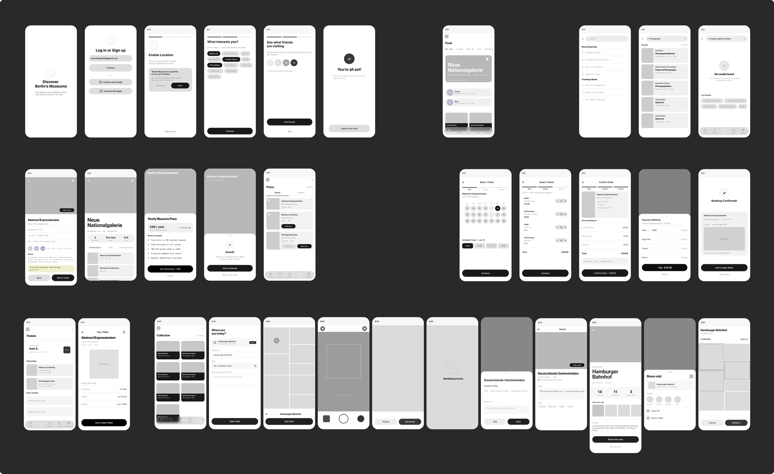
The wireframes covered all major flows across 35 screens: onboarding, feed and discovery, exhibition and museum detail, the full booking flow, tickets wallet, and the entire capture and gallery experience. The focus at this stage was structure and hierarchy, and making sure each screen contained the right information in the right order before any visual decisions were locked in.
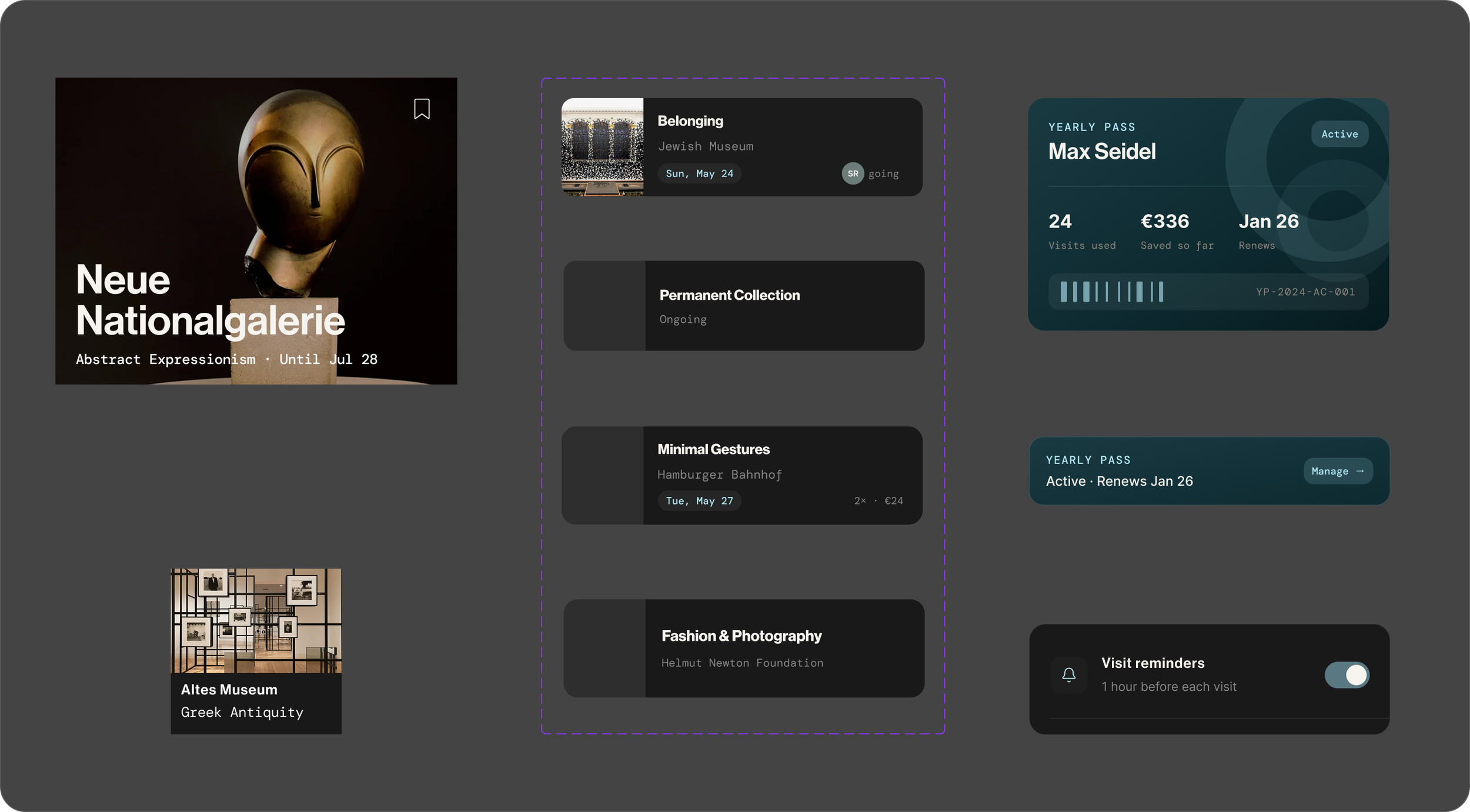
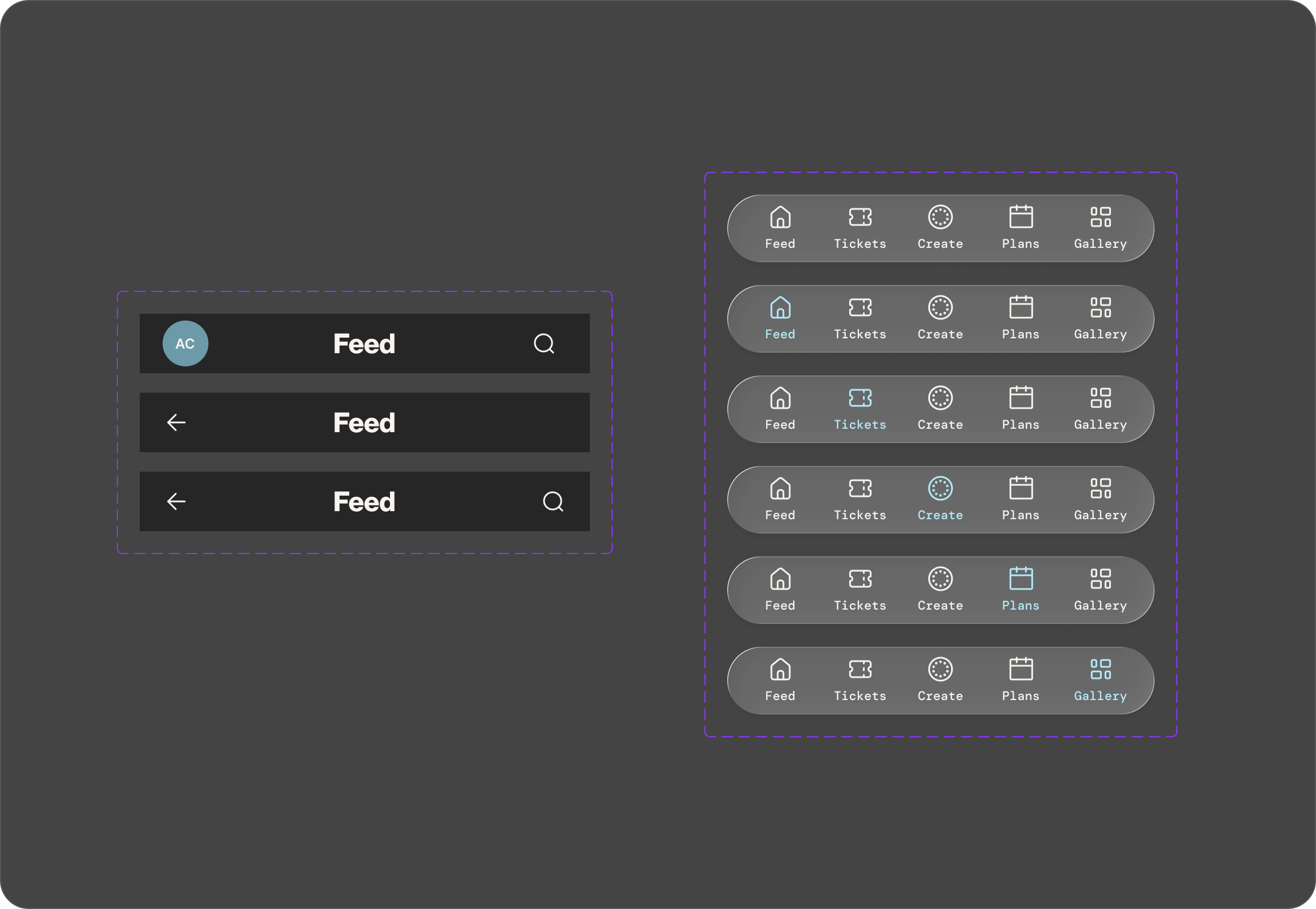
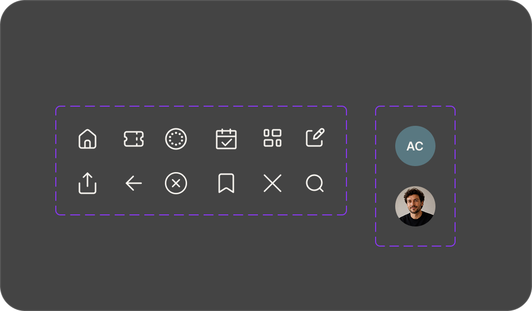
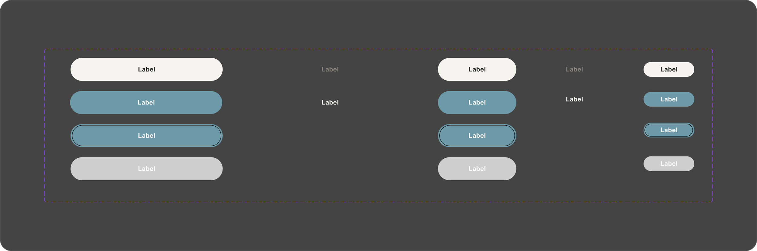
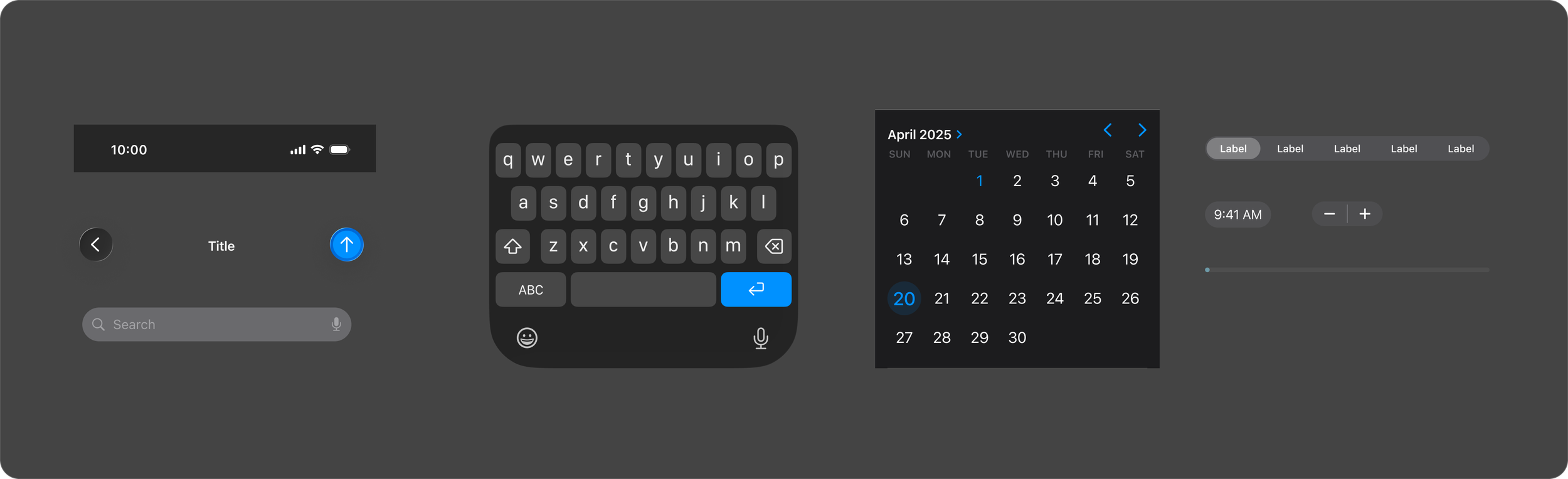
The component library was built around the patterns those screens produced: hero cards and small cards, the Yearly Pass highlight card, icon and text rows, top and bottom navigation variants, button states, and the iOS UI kit elements needed for a faithful mobile prototype. Each component was defined once. Spacing, corner radius, touch targets, and state variants all resolved at the library level, so they never had to be rethought screen by screen.
By the time the visual language was finalised, the product structure was already solved. Applying the design system on top of a tested wireframe base meant high-fidelity work was refinement, not re-exploration.
Hi-Fi Prototype
With the wireframes validated and the component library in place, moving to high fidelity was a focused process rather than a creative leap. The design system, colour tokens, typography scale, imagery rules, and tone of voice were applied systematically across all 35 screens. Real content replaced placeholders: actual exhibition names, museum addresses, dates, and prices. The result was a prototype that looked and behaved close enough to a real product that users could interact with it without being distracted by its unfinished state.
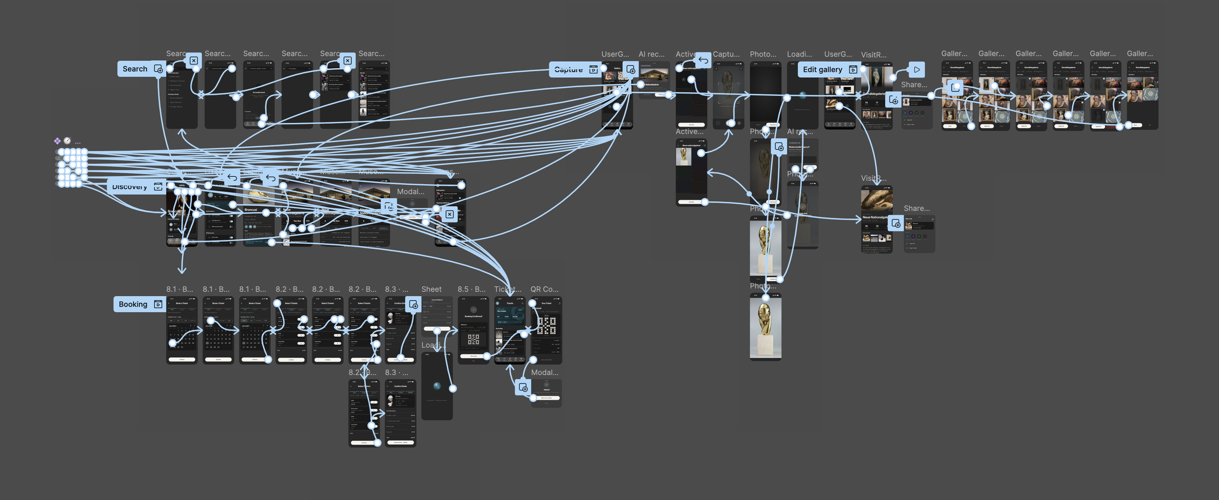
We fully prototyped two flows in Figma for testing: discovery to booking, and on-site capture. These covered the two most critical user journeys identified in the research. Finding and securing a visit and preserving the memory of it.
Usability Testing
We ran usability testing sessions with participants matching the persona profile. Berlin locals and visitors who visit museums occasionally and plan spontaneously. Each session followed the same structure: participants were given a scenario and asked to complete key tasks without guidance, while we observed where they moved confidently and where they hesitated.
The two prototype flows were tested separately. For the booking flow, the key tasks were finding an exhibition, saving it, and completing a ticket purchase. For the capture flow, participants were asked to start a visit, photograph an artwork, and review the recap at the end.
Feedback and final iterations
Testing produced clear, consistent feedback that led to three specific changes.
The onboarding chat felt unfamiliar. Participants expected a form and hesitated before interacting. We added an animated prompt on first load to signal the chat was interactive, which removed the hesitation in follow-up sessions.
In the booking flow, the Yearly Pass row on the Ticket Type screen caused confusion. Participants with a pass were unsure whether selecting it would override or add to their other tickets. We redesigned the row to show the saving amount inline and added a short explanatory line beneath it.
In the capture flow, the transition between photographing an artwork and the AI recognition modal felt too abrupt. Participants were not sure if they had triggered anything. We introduced the "Analysing your picture..." loading state with the animated sphere, giving the process a visible moment before the result appeared.
The Visit Recap screen tested strongly across all sessions and needed no structural changes, only minor copy adjustments to the share prompt.
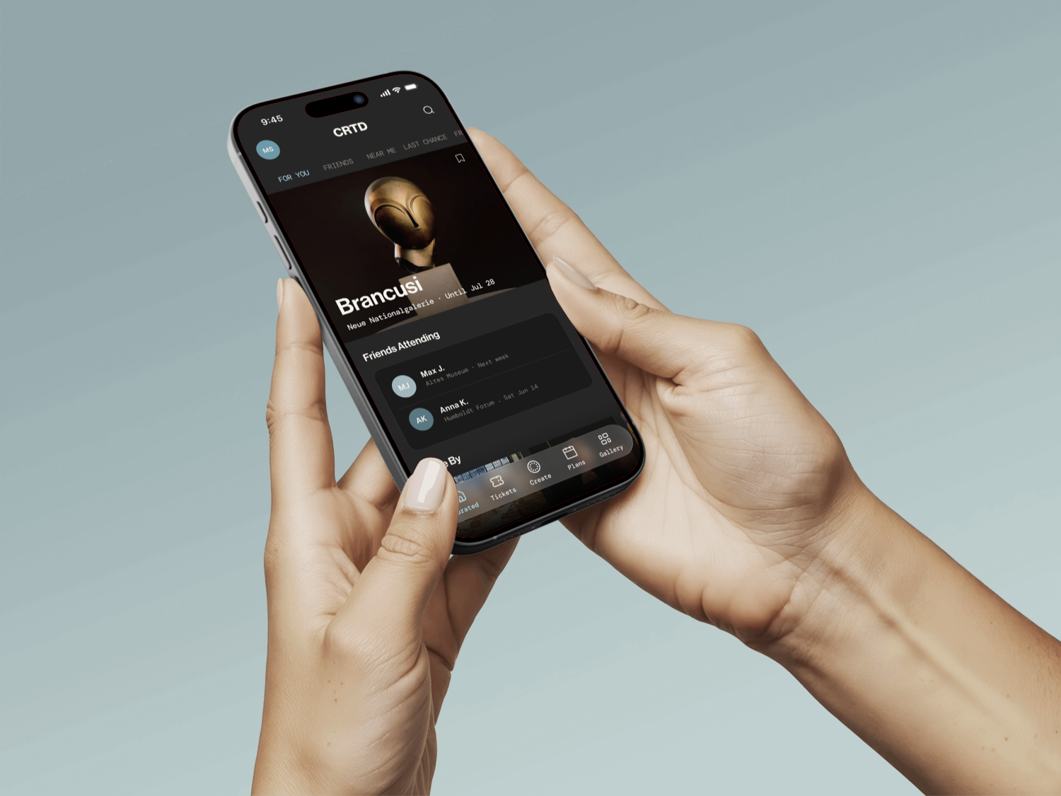
Watch the walkthrough below to see the app's main flows and key features in action.